Why Your Dashboards Probably Suck (and How to Fix it)
Loves Data

There are many reasons why your dashboards may suck. A common reason is that it’s very easy to produce dashboards with just data instead of actionable insights. But another key failing of dashboards that we’ve seen again and again is that a lot of common dashboards focus on reporting on the ‘top’ performers, missing the long tail insights. Take the Google Analytics dashboards. These do not have the most sophisticated visualisations for big data, but a lot of people use them (including us at Loves Data) because they are so convenient. However, the visualisations can make it hard to see the performance of your website in its totality. Good thing we’ve done a bit of thinking about how to get those insights you really want, using content and channel groupings for your dashboards (pro-tip: we also cover content and channel groupings in the 2015 Analytics Conference Masterclass).
So, what’s the problem?
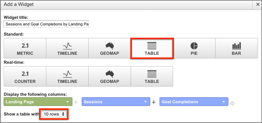
The table widget has a maximum of ten rows, which corresponds to the “I want to see my top ten landing pages” impulse that many of us have:
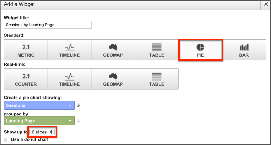
The pie chart is worse, with a maximum of six slices:
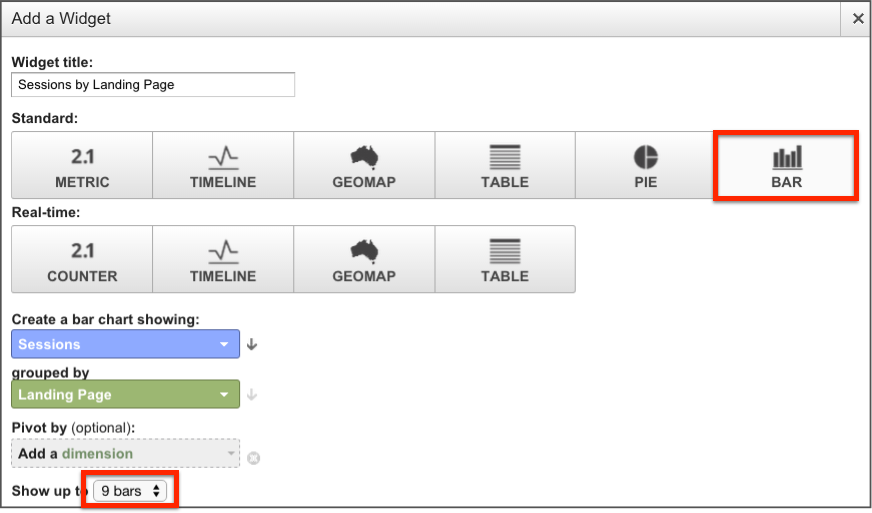
The bar chart has a maximum of nine bars:
It’s important to understand that this is not necessarily Google being stingy with its dashboarding options. If there was an option to include 20 bars in a bar chart, your eyes may glaze over – even if you are an experienced analyst, to say nothing of other stakeholders.
So what kind of data would these three widgets above actually produce?
Dashboard Table Widgets
Here, we have the top ten landing pages of our website, and we can see that /landing-page-1 has the lion’s share of goal completions. Maybe we can think of an improvement to this landing page – should our next step be a conversion test on this page?
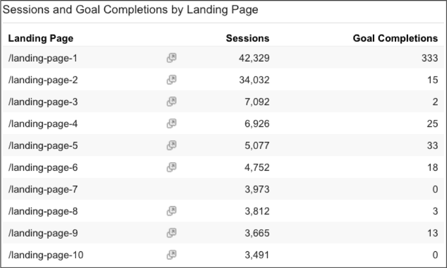
There is not enough information on this widget because it only lists the top ten landing pages. This is fine for very small websites, but for larger websites the data here could be completely meaningless or inaccurate. What if the 16th most popular landing page by sessions actually had 800 conversions? This widget couldn’t tell you; it cannot report on the most important landing pages for you to improve by definition.
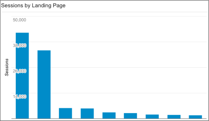
Dashboard Bar Charts
The bar chart is not much better, showing the top ten visually but not indicating how much we’re missing.
Dashboard Pie Charts
Only when we get to the pie chart do we see this giant category called ‘Other’, because a pie chart is meant to show the totality. We can actually see that the vast majority of traffic is not going to the top six pages.

Now, the pie chart above can’t fit in landing pages 7–10, but we can see each one will be smaller, so the top ten pages won’t make up more than about a third of our traffic. If we want to start an analysis of top landing pages for this website, the pie chart tells us that the top ten pages won’t get us there. We have to be more holistic because this website has a long tail for landing pages.
Let’s look at the impact of the long tail
How bad is the problem? We estimated the size of the long tail for 6 websites from an anonymous client pool, determining what percentage of traffic would not make it to a top 10 list, if we created a widget table showing top source/medium, top landing page and top paid search query.
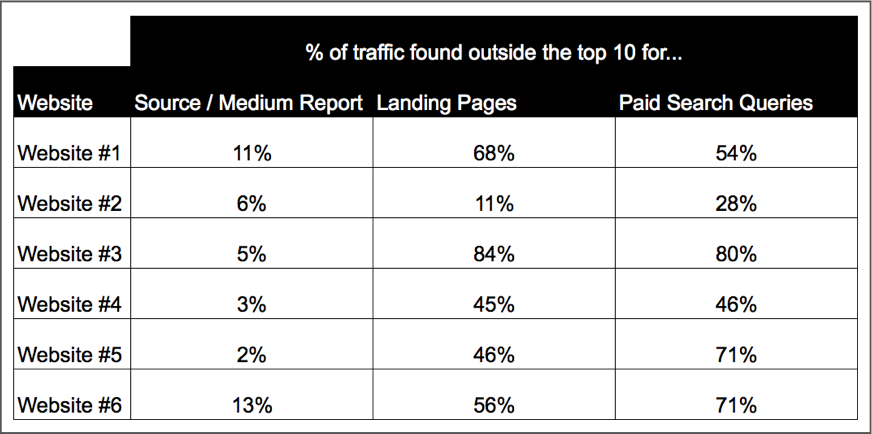
The source/medium reports fared the best. For a lot of our websites, the bulk of our traffic really is made up of a couple of core sources (e.g. Google organic, Google CPC, direct, maybe Facebook, Bing and a couple of referrals/custom campaigns). Even then we can be missing important insights.
For landing pages and paid search queries the situation is more dire. Particularly for website #3, where we would be missing over 80% of our traffic with a standard dashboard widget. The larger your website, the more diverse its user base, pages and marketing channels, the more of a long tail problem you are likely to have with your dashboards.
A solution: use grouping options in Google Analytics
So how can we solve this problem and make our dashboards more holistic? We can try make the visualisations bigger, but adding more bars to a bar chart won’t make for a pretty picture. We can try interactive charts, but no matter how interactive they are, they still won’t tell a great story if they can’t show the whole picture in one simple visualisation. The main solution would be to stop looking at individual items (such as keywords or landing pages), at least at the top level and group the data.
Most dimensions we may want to see have some grouping options in Google Analytics.
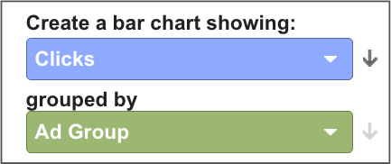
For paid keywords, these would be triggered by a particular Google AdWords ad group so we can create a bar chart of the top ad groups instead of top keywords:
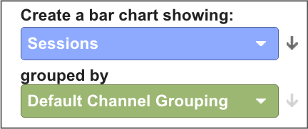
For our traffic sources, Google automatically groups them into channels, which you can access using the Default Channel Grouping dimension. You can also modify how these are grouped to better reflect your organisation, and we recommend that you do so:
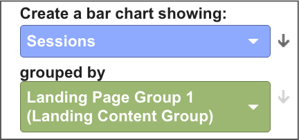
Google Analytics also let you create up to 5 content groupings, or ways to group together your pages. Each of the 5 groupings can have as many members as you like but for a top-level grouping, even for a very large website, you probably don’t want to break it up into more than 6–8 groups, which you can then easily visualise in a dashboard.
By checking the size of your long tail, you can then flag if your dashboards are not holistic enough and start transforming them into something that is more actionable.
Want to learn more about how content and channel groupings can help your analysis? Join us at the 2015 Analytics Conference Marketing Masterclass, where we cover this in more depth.

Comments