Unlocking the Full Potential of Looker Studio: A Guide to Visualizing and Analyzing Your Data
Loves Data
Data is the lifeblood of modern digital marketing. Accurate and insightful data visualization and analysis are critical for identifying trends, uncovering insights, and making data-driven decisions. Looker Studio (previously known as Google Data Studio) is a powerful and user-friendly tool that allows you to create engaging, interactive, and informative reports and dashboards from your Google Analytics, Google Ads, and other data sources.
In this guide, we'll walk you through the process of unlocking the full potential of Looker Studio to elevate your data analysis capabilities and create meaningful visualizations that drive informed decisions. Whether you're new to data visualization or an experienced analyst seeking to refine your skills, this guide will serve as an invaluable resource in your journey toward data mastery.
We'll cover essential Looker Studio features and functionalities and provide expert guidance on best practices for designing, constructing, and sharing reports and dashboards. By the end of this guide, you'll be equipped with the knowledge and skills required to transform complex and disparate data into clear, actionable insights.
Are you ready to take your data visualization and analysis abilities to new heights? Let's get started with Looker Studio!

Connect and Prep Your Data Sources in Looker Studio
A successful data visualization starts with selecting the right data sources and preparing your data for maximum impact. Looker Studio allows you to connect to a wide array of data sources, from Google Analytics and Google Ads to CSV files and databases. Follow these steps to connect and prepare your data in Looker Studio:
- Connect Data Sources: Begin by navigating to the "Data Sources" tab in Looker Studio. Click on the "+" button to add a new data source and follow the prompts to connect your desired data platform.
- Blend and Join Data: If you're working with multiple data sources, you can blend or join your datasets to create comprehensive views and simplify your analysis. To blend data, select multiple connectors in a single chart, or use the "Join" functionality to link datasets based on shared keys.
- Clean and Transform Data: Looker Studio offers built-in data transformation functions that enable you to clean, filter, and format your data to improve analysis and visualization. Use these functions, such as "Case" statements and date formatting, to generate a polished and cohesive dataset.
With your data sources connected and prepared, you'll be ready to create stunning visualizations and actionable insights.
Create Engaging and Informative Visualizations
Now that your data is ready, it's time to dive into the exciting world of data visualization. Looker Studio offers a wide range of chart types and customization options to help you bring your data to life. Consider these best practices when creating visualizations:
Select the Right Chart Type
Choosing the right chart type is crucial for effectively communicating your data's story. Consider the type of data you're working with and what message you want to convey:
- Bar or Column Charts: Great for comparing values across categories or displaying trends over time.
- Line or Area Charts: Ideal for showcasing trends, patterns, and changes over time.
- Pie or Donut Charts: Suitable for displaying proportions or percentages of a whole.
- Maps and Geocharts: Designed to visualize geographic data and regional differences.
- Scorecards and Tables: Perfect for displaying detailed numerical information.
Customize and Annotate Your Charts
Looker Studio offers powerful customization options to tailor your charts' appearance and functionality. Leverage these tools to develop an engaging and cohesive visual narrative:
- Apply consistent color schemes, fonts, and branding elements to your charts.
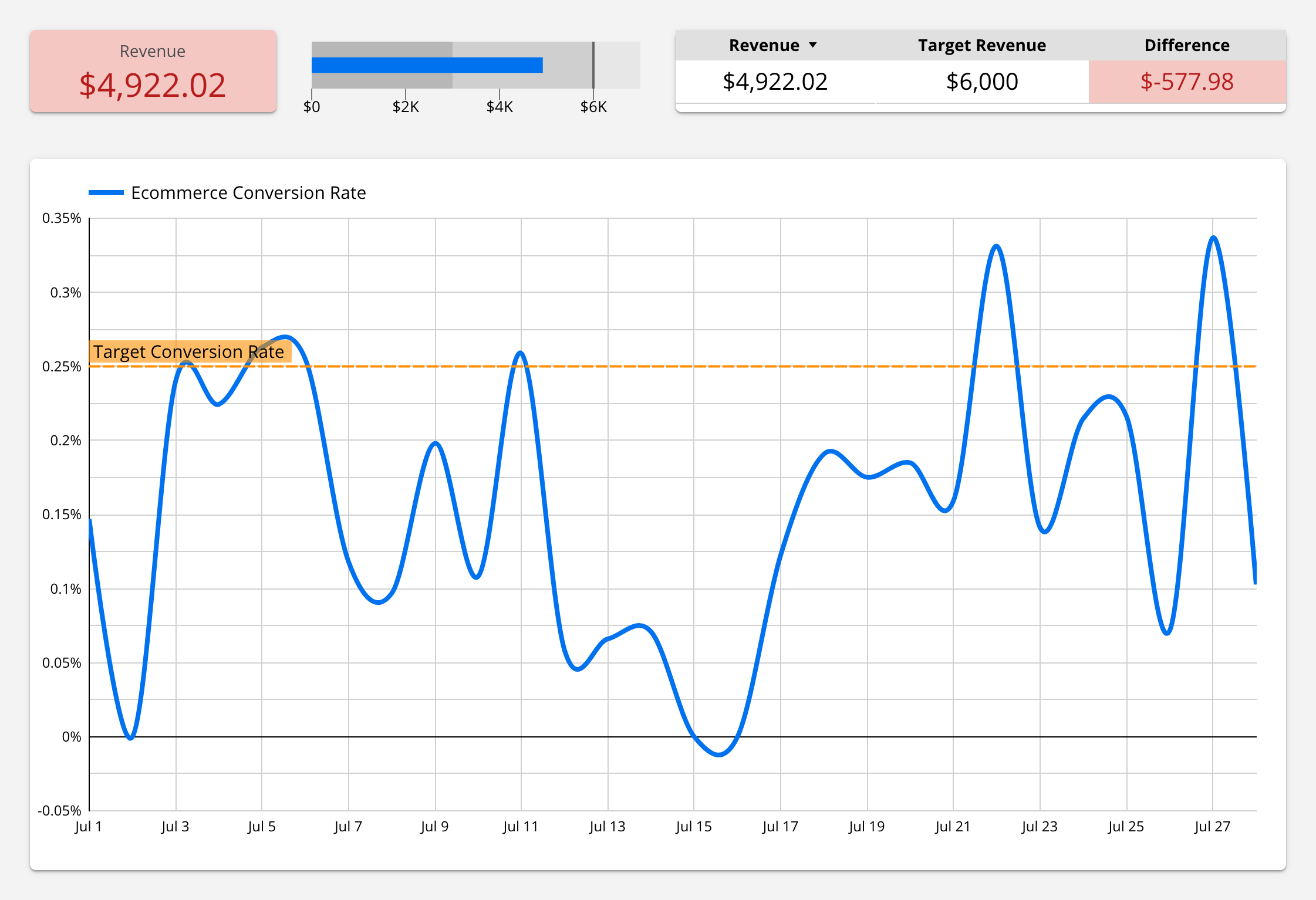
- Use annotations and notes to add context and emphasize key data points.
- Implement interactivity, such as filters and drill-down capabilities, to enhance user engagement.
By following these best practices, your visualizations will not only be visually appealing but also convey your data's message clearly and effectively.
Build and Organize Your Reports and Dashboards
Once you've created your visualizations, it's essential to compile and organize them into intuitive, actionable reports and dashboards. Follow these expert tips for constructing a compelling data story:
Utilize a Logical Structure and Hierarchy
Organize your visualizations in a meaningful sequence by placing high-level summary charts at the top of your report and more detailed, granular charts further down. Utilize sections and headers to group related visualizations and provide context.
Balance Design and Functionality
Strike a balance between aesthetic design elements and functional chart components in your reports and dashboards. Allocate sufficient white space and avoid overcrowding your layout to ensure a clean and readable presentation.
Implement User-Friendly Interactivity
Include interactive elements, such as drop-down filters, date range selectors, and clickable drill-downs, to allow users to customize their view and explore the data further. This will enhance user engagement and encourage deeper analysis.
By adopting these strategies, your reports and dashboards will provide an accessible and actionable data story for your audience.
Share and Collaborate on Your Data Insights
Finally, the power of data visualization lies in its ability to communicate complex information to diverse stakeholders. Looker Studio streamlines the process of sharing and collaborating on your reports and dashboards with these options:
- Shareable Links: Generate a shareable URL to provide quick access to your report or dashboard for colleagues and clients.
- Embeddable Reports: Embed your visualizations directly into web pages and applications for seamless integration within your organization's data ecosystem.
- Export Options: Export your reports as PDFs or CSV files to facilitate offline viewing, sharing, and further analysis.
Leverage these features to ensure your valuable data insights reach their intended audience and drive data-driven decision-making.
Master the Art of Data Visualization with Looker Studio
By following this guide and embracing the features and best practices outlined here, you'll be well on your way to becoming a Looker Studio expert, transforming raw data into meaningful, engaging, and actionable visualizations. As you continue to hone your data visualization skills and leverage the full potential of Looker Studio, you'll unlock new insights, drive informed decisions, and elevate your organization's data-driven culture.
Ready to take your Looker Studio expertise to the next level? Check out our Looker Studio course, covering the steps and techniques to create powerful, insightful reports and dashboards using data from Google Analytics.


Comments