Transform Your Reporting: A Looker Studio Dashboard Design Deep Dive
Loves Data
As business professionals across various industries realize the power of data-driven decision-making, the importance of clear, informative, and actionable data visualizations grows significantly.
Looker Studio, previously known as Google Data Studio, is a powerful reporting and visualization tool that enables you to create compelling dashboards that bring your data to life. By mastering the art of dashboard design, you can turn raw data into valuable insights, making it easier to drive meaningful actions and business growth.
In this in-depth article, we'll explore the best practices and essential elements of Looker Studio dashboard design, empowering you to create captivating and insightful visual representations of your data. With Loves Data guiding you on your Looker Studio journey, you'll uncover valuable tips on choosing the right charts, organizing your dashboard for maximum impact, and making your data visually engaging and easy to understand.
Join us as we dive deep into Looker Studio dashboard design and take the first step towards transforming your data reporting and unlocking the true power of visualization.
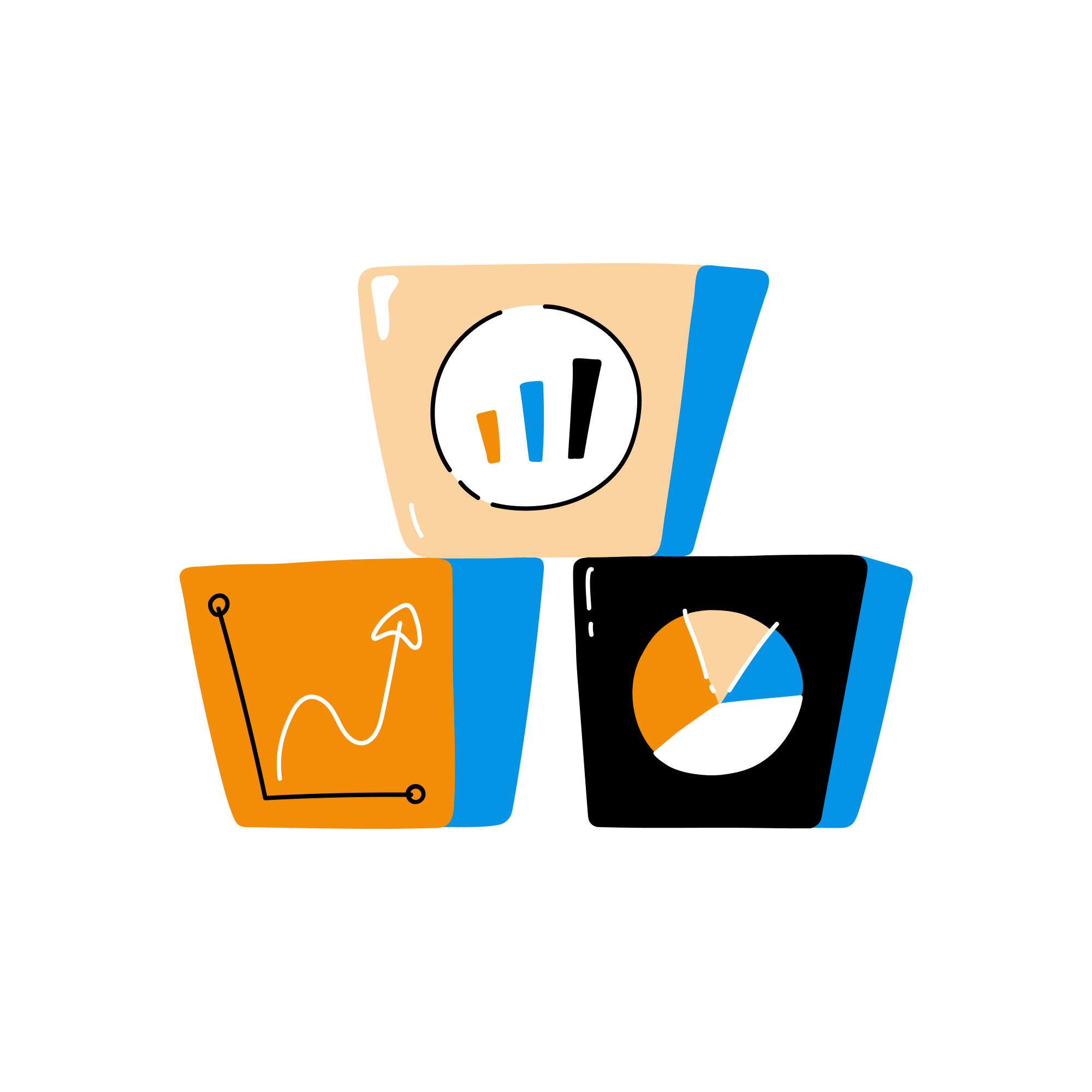
1. Choosing the Right Visualizations
Selecting the appropriate visualization type is crucial for effectively communicating your data in Looker Studio. Some common chart types used in dashboard design include:

- Bar Charts
Bar charts are ideal for comparing values across categories. Vertical bar charts, also known as column charts, are useful for displaying time-based data, while horizontal bar charts display categories with long labels.
- Line Charts
Line charts show data trends over time and are excellent for visualizing continuous data. Use line charts to display metrics like revenue, website visits, or conversions over specific periods.
- Pie Charts
Pie charts are useful for displaying data as percentages of a whole. Use them to visualize the proportion of a metric, such as the distribution of traffic channels or customer segments.
- Table Charts
Table charts display data in a tabular format, making it easy to compare values across categories and periods. They work well for displaying detailed data and provide more context than charts that use visual elements alone.
Consider the message you want your dashboard to convey and the questions your audience might have when selecting the appropriate visualization type.
2. Organizing Your Dashboard Layout
A well-organized dashboard layout ensures that users can quickly and easily access the information they need. Follow these best practices for organizing your Looker Studio dashboard:
- Group Related Data
Place related charts and data points close together to create a more cohesive view of your data. Grouping related elements helps users draw connections between different metrics and understand the overall context better.
- Use a Logical Flow
Order charts and visualizations in a way that makes your data easy to understand. Generally, place high-level overviews or summaries at the top of the dashboard, followed by more detailed data as you move down the page.
- Utilize White Space
Make sure to overcrowd your dashboard with enough charts and elements. Ample white space helps users focus on the most important information and prevents cognitive overload.
- Create Clear Sections
Use headers, dividers, and color schemes to differentiate specific sections within the dashboard. This separation helps users quickly locate the information they need.
Remember that your dashboard layout should reflect your business goals and the unique needs of your audience.
3. Enhancing Data Clarity and Legibility
To ensure the effectiveness of your Looker Studio dashboard, follow these guidelines for maintaining clarity and legibility in your data visualizations:
- Simplify Your Charts
Avoid using overly complex chart types or including too many data points in your visualizations. Focus on displaying essential information that drives meaningful insights.
- Use Consistent Color Schemes
Apply consistent color schemes throughout your dashboard to establish a cohesive look and make it easier for users to understand different charts. For example, use the same color for a specific metric or category across all related visualizations.
- Optimize Text Size and Style
Choose font sizes and styles that are easy to read and digest. Avoid using small text or overly decorative styles that can distract from your data.
- Utilize Tooltips
Include tooltips to provide additional context and explanations for chart elements. Tooltips can help users decipher complex data points without cluttering the dashboard.
- Highlight Key Data Points
Make important data points stand out by using color, bold text, or other visual cues that draw the user's attention to the essential information.
4. Making Your Dashboard Interactive
Interactive dashboards provide users with more control over the data and enable them to explore multiple perspectives without overwhelming the interface. Utilize Looker Studio's interactive features to enhance your dashboard's user experience:

- Use Filters
Filters allow users to view data based on specific criteria, such as date ranges or segments. Use filters to help users tailor the dashboard's data to their unique needs and answer specific questions.
- Enable Drill-Downs
Drill-down functionality lets users click on a data point within a visualization to display more detailed information. Implement drill-downs to help users explore the data's underlying layers without overwhelming the main dashboard.
- Customize Data Sorting
Allow users to sort data within table charts or other visualizations based on different metrics, such as values or labels. This customization can help users prioritize data and identify trends more effectively.
By designing an interactive dashboard, you empower users to analyze data in a way that aligns with their unique goals and interests.
5. Ensuring Your Dashboard is Actionable
Your Looker Studio dashboard should not only display data but also help users identify opportunities for improvement and make informed decisions. To create an actionable dashboard:
- Focus on Key Performance Indicators (KPIs)
Emphasize the KPIs that align with your business objectives and help users understand their performance. Display KPIs prominently at the top of your dashboard or use visual cues to highlight essential data points.
- Use Clear, Concise Language
When labeling charts or tooltips, use clear and concise language to help users understand the context of your data. Avoid jargon and complicated terminology that may lead to confusion.
- Provide Context
Add benchmark or industry-average data to your visualizations to help users evaluate their performance relative to competitors or industry standards. This context can help users understand the significance of their metrics and identify opportunities for improvement.
- Monitor and Update
Regularly review and update your dashboard to ensure it remains relevant and reflective of your organization's changing goals and priorities. This continuous improvement ensures your dashboard drives meaningful actions and supports business growth.
By following these best practices, you can create a Looker Studio dashboard that transforms your data into valuable insights, enabling users to make data-driven decisions and propel your business forward.
Bringing It All Together: The Power of Looker Studio Dashboards
Combining the best practices outlined in this article, you can create visually engaging, insightful, and effective Looker Studio dashboards that empower your marketing team to make data-driven decisions and drive business success. Remember to choose the right visualizations, organize your layout, maintain data clarity, and ensure your dashboard remains actionable and informative.
Ready to elevate your reporting game with Looker Studio and discover the true potential of data visualization? Loves Data is here to help! Whether you're new to dashboard design or looking to refine your skills, our expert team offers support, guidance, and Looker Studio training tailored to your needs.
Don't wait! Contact Loves Data today and unlock the power of your data with stunning Looker Studio dashboards.
Comments