The Power of Looker Studio: Create Robust Data Visualizations for Informed Decision Making
Loves Data
Data-driven decision-making is the key to unlocking your brand's full potential in today's digital market landscape. However, without effective tools to make sense of the vast amounts of data available, leveraging these insights can be daunting.
That's where Looker Studio (previously Google Data Studio) comes in – an exceptional data visualization tool that transforms raw data into insightful, actionable reports tailored to your organization's needs. At Loves Data, our mission is to guide you through the complexities of today's digital marketing landscape, and mastering Looker Studio is a critical component of this journey.
In this guide, we will introduce you to Looker Studio, its essential features, and the many ways it enables businesses to make informed decisions based on real-time, data-driven insights. With Looker Studio, you'll learn techniques to create stunning visualizations and reports that drive strategic decision-making, resulting in increased brand growth and improved performance. From connecting data sources to crafting compelling dashboards, this guide will help you navigate the fundamentals of Looker Studio with ease and polish.
You can also watch our Looker Studio tutorial to learn how to get started connecting and visualizing your data:
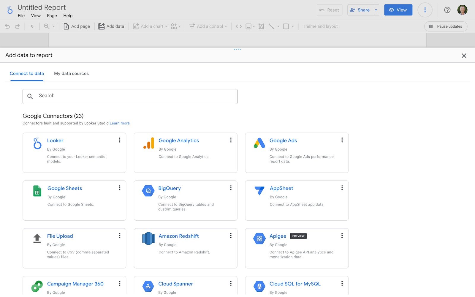
Connecting Your Data Sources in Looker Studio
The first step in harnessing Looker Studio's capabilities is connecting your relevant data sources. Integrating with a variety of data sources, this powerful tool can handle everything from Google Analytics and Ads to databases and spreadsheets. Here's a brief guide on connecting your data:
- Choose a Data Source: Start by selecting the appropriate data source connector from the Looker Studio library, including options such as Google Sheets, BigQuery, SQL databases, and more.
- Authorize Access: Ensure Looker Studio has the necessary authorization to access your chosen data source.
Configure Connection: Customize the connection settings based on your data source's requirements and preferences.
With your data sources connected, you're ready to start creating visualizations, exploring insights, and generating powerful reports.
Designing Actionable and Aesthetic Visualizations
Creating visually compelling and informative visualizations is at the heart of Looker Studio. With a range of customizable chart options and design elements, Looker Studio allows you to craft striking visualizations tailored to your specific needs.
- Choose the Right Chart Type: Select a visualization type based on your data and the message you want to convey, such as line charts for trends, bar charts for comparisons, or pie charts for proportions.
- Customize Data Dimensions and Metrics: Define your report's X and Y axes by selecting from your data source's dimensions and metrics, ensuring your visualization displays the relevant and desired information.
- Style Your Visualizations: Utilize Looker Studio's built-in design features to tweak colors, fonts, and other design elements, ensuring your visualizations are visually engaging.
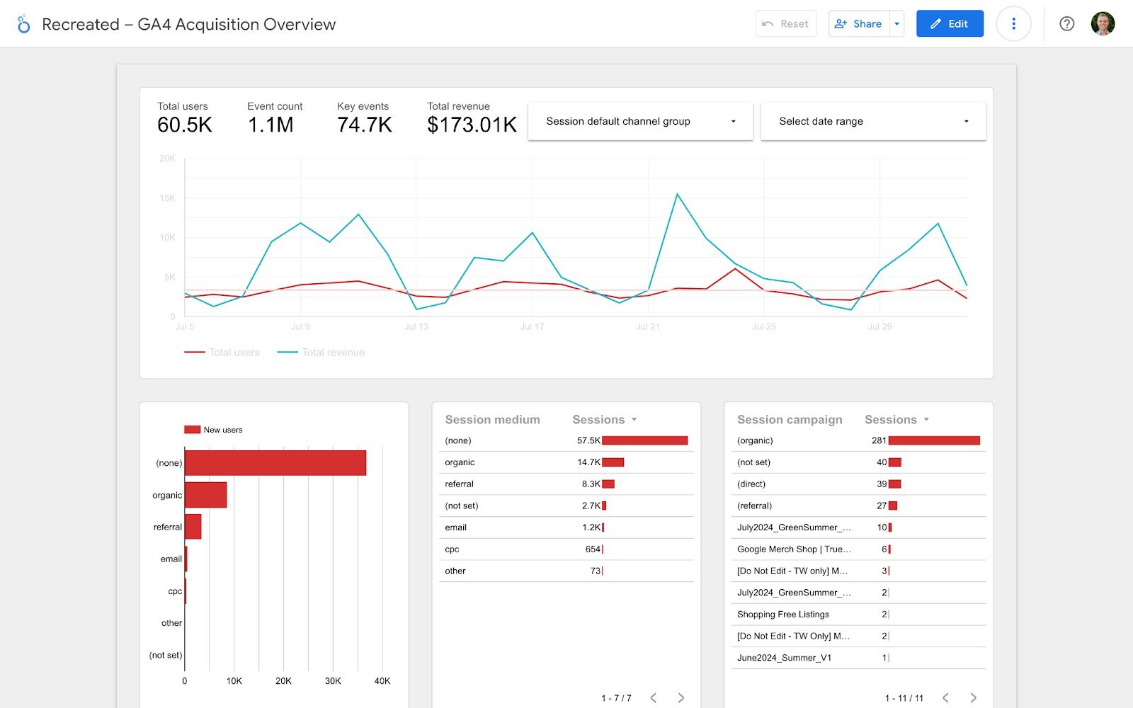
A well-designed visualization not only captures attention but also simplifies complex data, making it easier for stakeholders to understand and act upon.
Crafting Comprehensive Dashboards for Decision-Making
Dashboards are an essential aspect of Looker Studio, as they allow you to bring together multiple visualizations, creating a cohesive, high-level view of your data insights for informed decision-making:
- Organize Your Dashboards: Arrange your visualizations logically, grouping related metrics and charts together to create a seamless narrative.
- Filter Data for Context: Add filters that enable users to segment the data displayed on the dashboard, allowing more in-depth exploration for specific timeframes, locations, or other relevant criteria.
- Customize Dashboard Layout: Optimize the layout for different screen sizes or presentation formats, ensuring that your dashboard is accessible and easy to interpret for your intended audience.
A thoughtfully designed dashboard makes it easier for decision-makers to quickly grasp the insights of your data, leading to more informed choices and strategies.
Sharing and Collaborating with Looker Studio
Looker Studio's collaborative features make it easy to bring teams together to share and discuss insights, fostering data-driven decision-making across your organization:
- Share Your Reports: Share reports with individuals or groups through email, schedule regular report deliveries, or generate shareable links, ensuring that everyone has access to the latest insights.
- Collaborate in Real-Time: Leverage Looker Studio's real-time collaboration capabilities to work concurrently with colleagues, leaving comments and making edits to create a collective understanding of your data.
- Export and Embed: Export your visualizations and dashboards in various formats or embed them into websites or applications, extending the reach of your data insights.
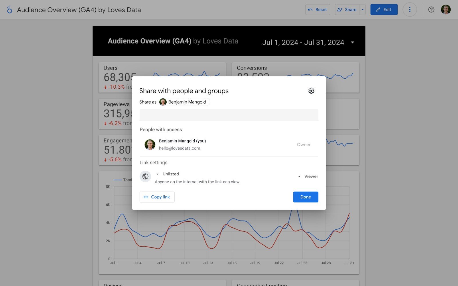
Encouraging a data-driven culture in your organization is easier when everyone can access, interact with, and contribute to the insights generated through Looker Studio.
Unleash the Power of Looker Studio for Data-Driven Success
Mastering Looker Studio empowers you to make data-driven decisions through actionable, aesthetic visualizations, and comprehensive dashboards. As you become proficient in connecting data sources, designing visualizations, crafting dashboards, and collaborating with your team, you'll unlock new growth opportunities and drive your brand's success.
With Loves Data as your guide, you can harness the full potential of our Looker Studio course, transforming your organization into a data-driven powerhouse.


Comments