Looker Studio Glossary
 Benjamin Mangold
There's a lot to explore inside Looker Studio, but what does it all mean? I'm going to help you understand the most important terminology you'll find when building reports and dashboards. Think of this as your Looker Studio dictionary, a quick reference to the stuff that matters. You'll find all of the most important terms right here, and you can also download the Looker Studio Glossary.
Get the Looker Studio Glossary
Table of Contents
- Area Chart
- Arrange
- Bar Chart
- Bins
- Blended Data
- Bullet Chart
- Calculated Field
- Calculated Field Formula
- Canvas Size
- Combo Chart
- Community Connectors
- Community Visualizations
- Compact Numbers
- Conditional Formatting
- Connector
- Control
- Credentials
- Cross-filtering
- Current Page Settings
- Data Control
- Data Freshness
- Data Source
- Date Range
- Default Date Range
- Dimension
- Dimension Value Colors
- Drill Action
- Drill Down
- Embed Report
- Export Data
- Field
- Field Editing
- Filter
- Filter Control
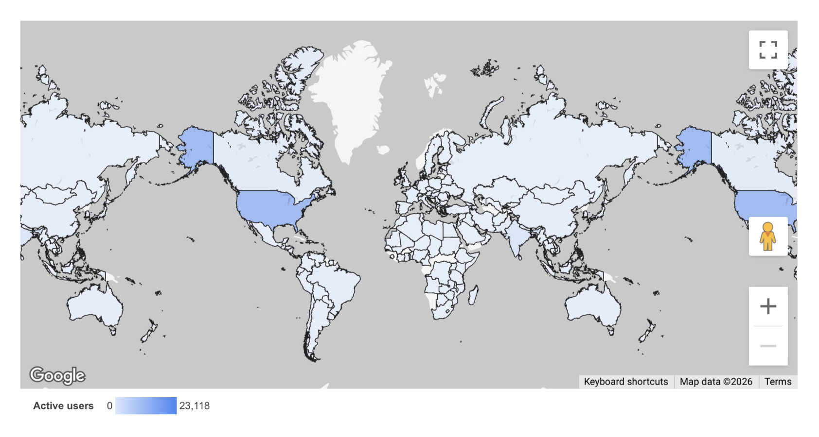
- Geo Map
- Google Maps
- Group
- Group Data
- Header Visibility
- Heatmap
- Keyboard Shortcuts
- Layout
- Log Scale
- Looker Studio Pro
- Make Report-level
- Make Page-level
- Metric
- Metric Sliders
- Navigation Position
- Page
- Parameters
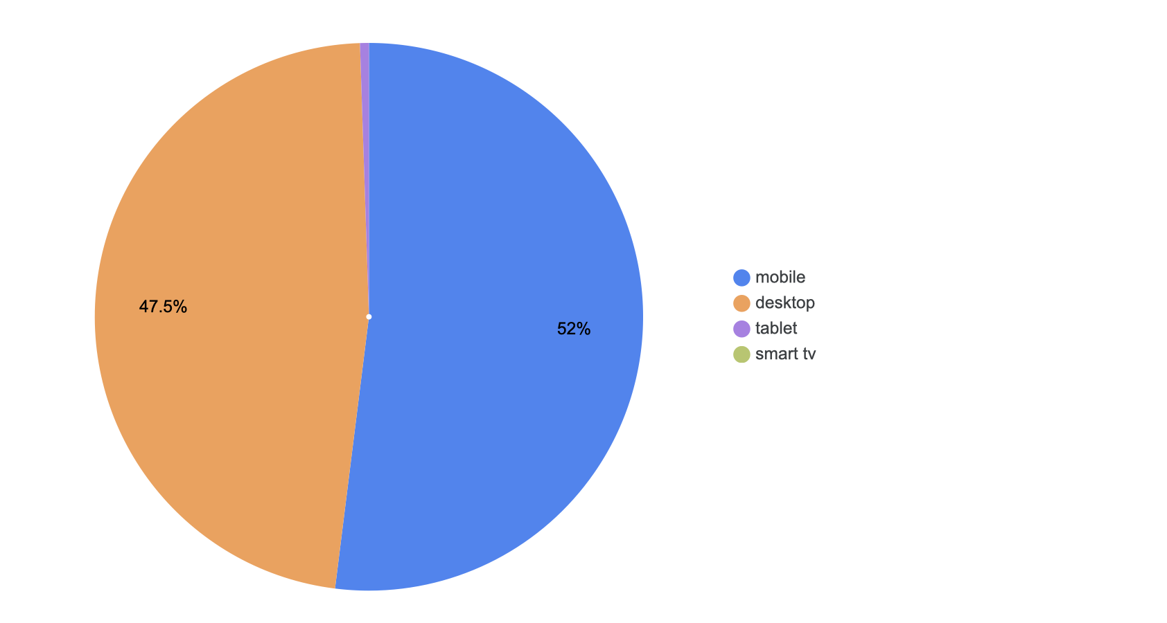
- Pie Chart
- Pivot Table
- Properties Panel
- Query Result Variables
- Range Limits
- Refresh Data
- Report Settings
- Report-level Component Position
- Resources
- Scatter Chart
- Scheduled Delivery
- Scorecard
- Share
- Sort
- Style
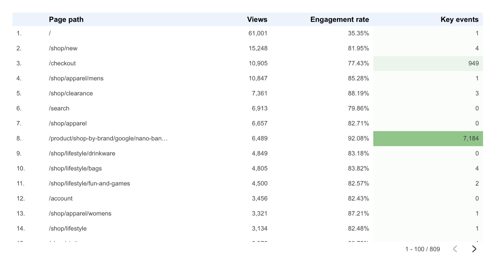
- Table
- Theme
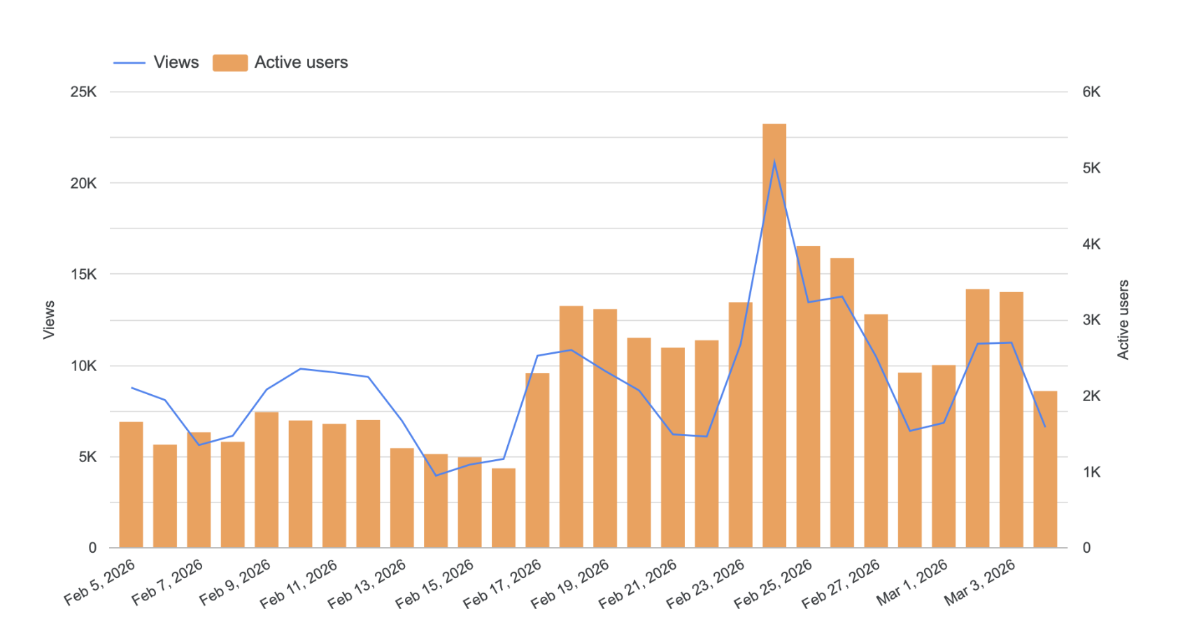
- Time Series
- Toggle Grid
- Treemap
- Trendline
- URL Embed
- View Mode
- Zoom Area
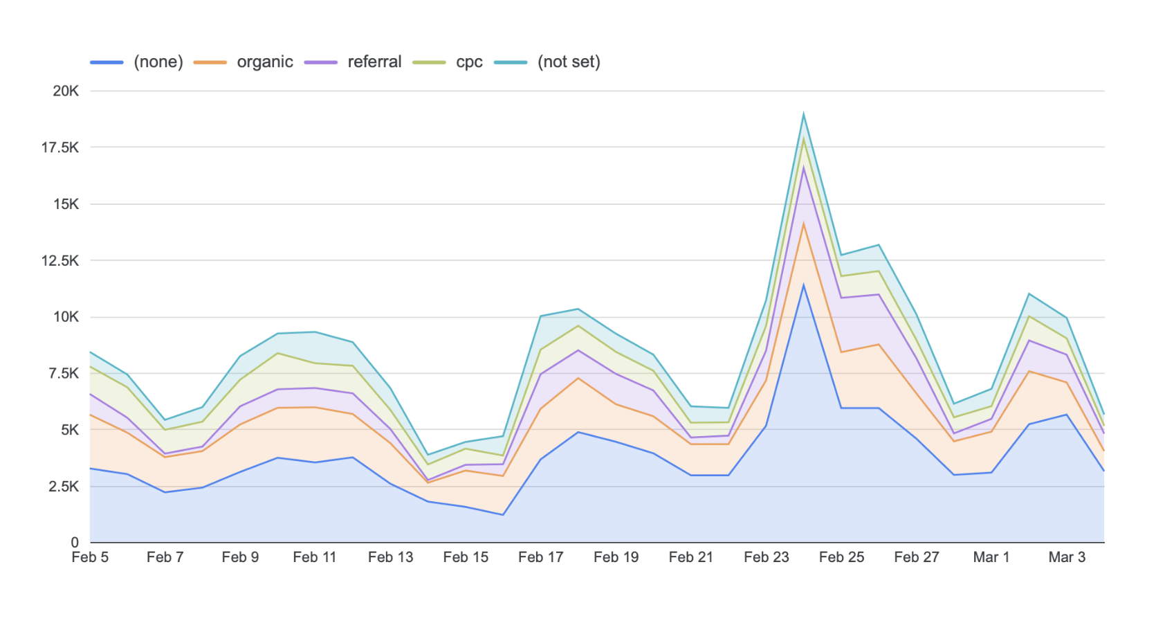
Area Chart
Area charts allow you to present data for a particular period, but they also allow you to segment the data by choosing a breakdown dimension. For example, when using Google Analytics data, the area chart will show you traffic by day broken down by traffic source.
Arrange
Choose how charts and elements are arranged in the report. You can place elements so they are in front or behind other items. Here are some keyboard shortcuts you can use to speed things up (replace ⌘ with CTRL if you’re using Windows):
- Bring to front ⌘+Shift+↑
- Bring forward ⌘+↑
- Send backward ⌘+↓
- Send to back ⌘+Shift+↓
You can also select multiple elements to align them horizontally, vertically, or distribute them. See also make report-level and group.
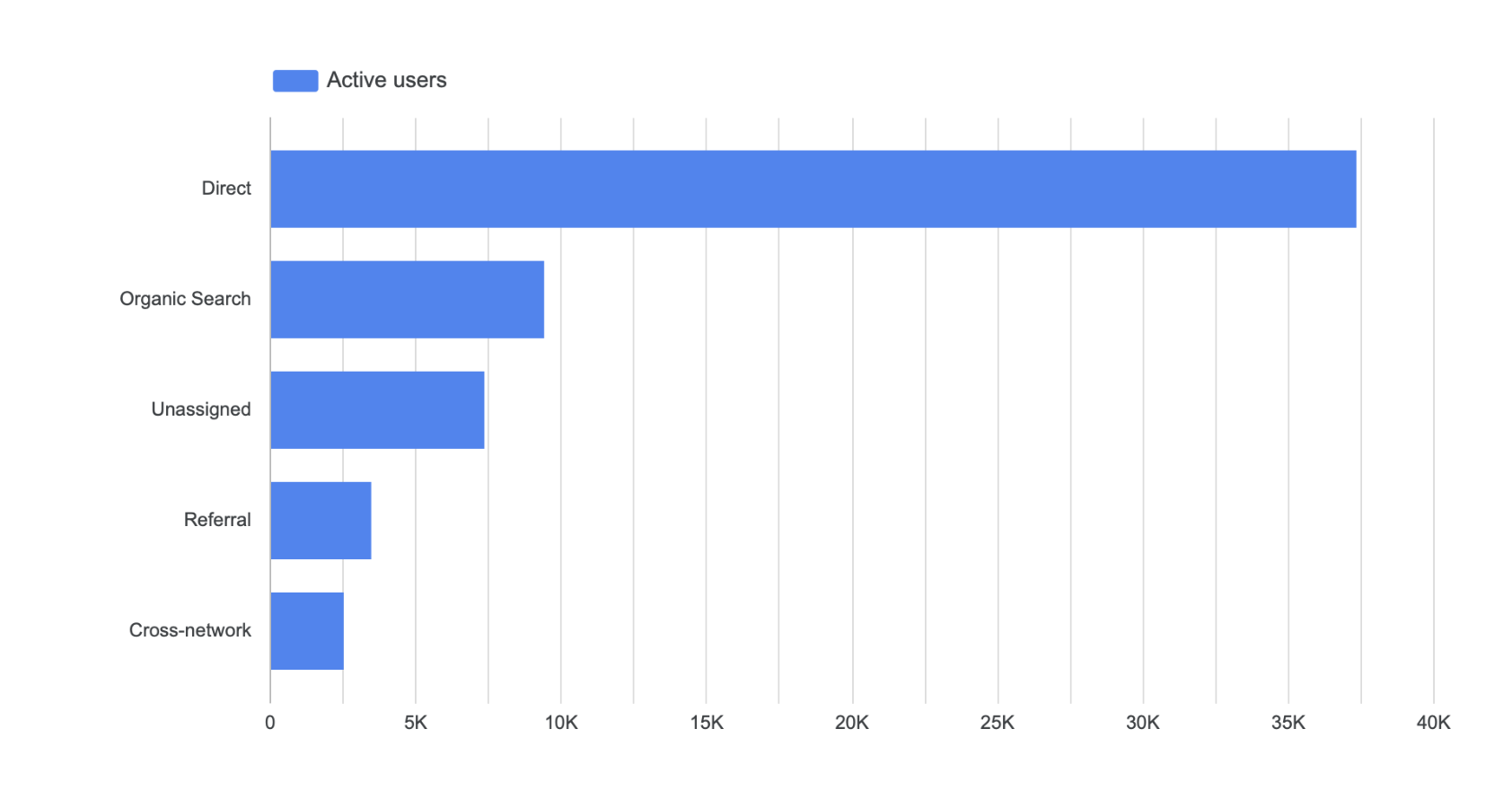
Bar Chart
Bar charts allow you to categorize and rank data. For example, a bar chart can be used to compare product sales, marketing channels and more.
Bins
Bins let you present values as ranges. For example, instead of reporting the exact number of sessions for each landing page, you can group them into ranges like 0 to 1000, 1000 to 2000, and so on. You can create bins using the built-in Bin field type, which lets you define numeric tiers without needing to write a CASE statement.
Blended Data
Combine data from multiple data sources into a single chart by creating 'blended data'. To combine data, you will need to add at least two data sources to your report and then choose a common dimension (called a 'join key') from both data sources.
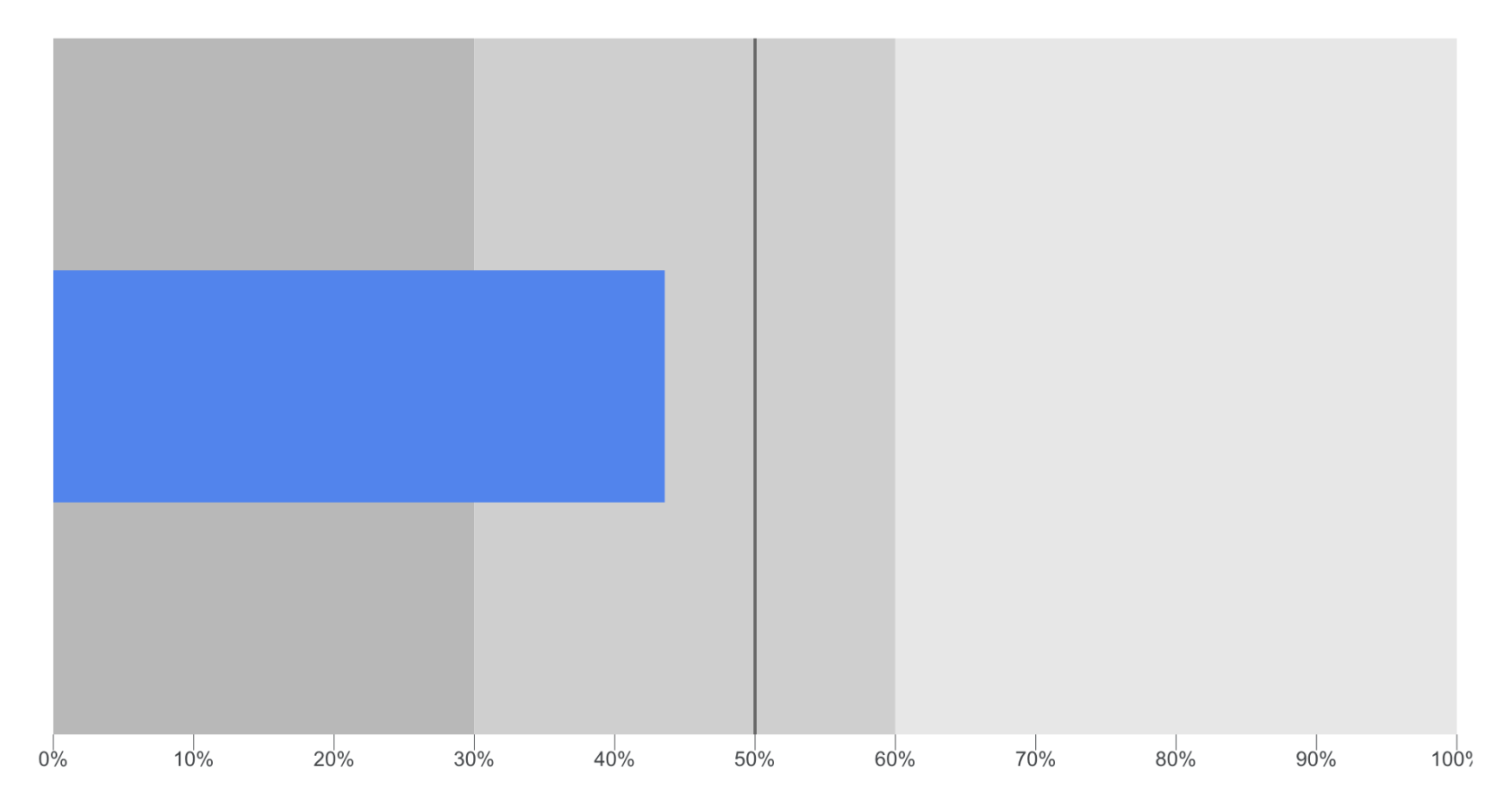
Bullet Chart
A bullet chart allows you to add a single metric to your report. Bullet charts can be useful for presenting KPIs because you can set a target for the metric.
Calculated Field
Calculated fields (or custom fields) allow you to create new metrics and dimensions based on existing metrics and dimensions available from your data source.
Calculated Field Formula
You can input different types of formulas to create calculated fields. You can use basic math formulas:
- Addition: +
- Subtraction: -
- Division: /
- Multiplication: *
And you can use functions:
- Aggregation, including SUM() and COUNT()
- Arithmetic, including ROUND()
- Date, including DAY(), WEEK() and YEAR()
- Geographic, including TOCITY() and TOCOUNTRY()
- Text, including LOWER() and REGEXP_REPLACE()
You can also use CASE statements to modify values. For example, if you wanted to clean up campaign names in your report you could use a formula like:
CASE WHEN REGEXP_MATCH(Session Campaign, ".*(AW - Dynamic Search Ads Whole Site|AW - Accessories)") THEN "Ads" WHEN REGEXP_MATCH(Session Campaign, "(Data Share Promo|Special Promo)") THEN "Promotion" ELSE "Other"END
Canvas Size
You can change the size of the pages in a report by adjusting the canvas size. You can select from US letter (portrait and landscape), screen (portrait and landscape) and custom.
Combo Chart
A combination chart allows you to combine a bar chart with a time series. See also bar chart and time series.
Community Connectors
Apart from the built-in data connectors, you can also make use of third-party connectors to pull data from other platforms into Looker Studio. For example, connectors are available for platforms like Bing Ads, Facebook Ads, Instagram, LinkedIn, and more. Third-party connectors generally require a paid subscription. See also connector.
Community Visualizations
Community visualizations are custom-built charts created by third-parties. They extend the types of visualizations you can use in your reports.
Compact Numbers
When data is presented in a chart, like a table, you can choose to display the full metric (number) or a short number. For example, a metric with the value of 10,398 would be shown at 10K as a compact number. To use a compact number select the ‘Style’ tab on the properties panel after you’ve selected a chart.
Conditional Formatting
Conditional formatting lets you apply color rules to data in your charts based on the values in your report. For example, you can highlight rows in a table where the bounce rate exceeds a certain threshold, or change the color of data labels in a bar chart based on performance targets.
Connector
A connector allows you to link a data source to your report. For example, the Google Analytics connector allows you to select a reporting view and data from that view is then made available in your report. You can use multiple data connectors with a report to bring data from different platforms together in a single report.
Connectors include:
- Google Analytics
- Google Ads
- Google Sheets
- BigQuery
- File upload
- MySQL
- Search Console
- YouTube Analytics
Control
You can add a control to your report to make it more dynamic. For example, adding an 'Input Box' control lets people search for values in a report. Control options include drop-down lists, fixed lists, inputs, advanced filters, sliders, and checkboxes. See also date range control and data control.
Credentials
When you add a data source, it will automatically make the data available to anybody who has access to the report. This is the default option which is ‘Owner’s Credentials’. You can also require that anyone who has access to the report also needs access to the underlying dataset. To do this, you’ll need to select ‘Viewer’s Credentials’ for the data source.
Cross-filtering
Cross-filtering lets viewers interact with your charts to filter the rest of the report. For example, clicking on a bar in a bar chart can filter a table below it. This makes it easier for viewers to explore the data and see trends without needing to use controls like drop-downs or sliders.
Current Page Settings
The current page settings allow you to select a data source for all of the charts on the current page. You can then select a default date range and filter for all the charts. The current page settings are available under the ‘Page’ drop-down.
Data Control
You can add a data control to quickly change the data used for the charts when viewing the report. For example, adding a Google Analytics data control allows you to quickly switch between the reporting views you have access to, to update the tables in the report.
Data controls are currently available for:
- Google Analytics
- YouTube Analytics
- Google Ads
- Campaign Manager
- Search Console
You can also select one or more charts and group them with the data control. Only the grouped charts are updated with the selected data source.
Data Freshness
Controls how often Looker Studio fetches new data from your data source. For example, a freshness setting of 12 hours means the data is updated twice a day. This helps improve performance by reducing how often queries are run. You can adjust freshness settings for each data source.
Data Source
Once a platform is connected to Looker Studio, it becomes a data source for the report. A data source includes all of the dimensions and metrics from the selected platform, as well as any calculated fields that have been created. See also connector.
The data source also allows you to modify how metrics and dimensions are treated in the report. For example, you can change a metric from a number to a percent, and decide if the data should be aggregated or not.
Date Range
Each chart has a date range which determines the amount of data that it presents. The default date range can be changed to a custom date range. Custom date ranges can be fixed (and not change) or dynamic which will mean the data will be different depending on when you view the report. Dynamic date range options include:
- Last 7 days
- Last 14 days
- Last 28 days
- Last 30 days
- Today
- Yesterday
- This week
- Last week
- This month
- Last month
- This quarter
- Last quarter
- This year
- Last year
- Advanced
Default Date Range
The default date range for charts is the last 28 days worth of data, excluding today.
Dimension
A dimension is typically information, like an attribute or characteristic. For example, if you connected data from Google Ads, then common dimensions include the name of your campaigns and your keywords. See also metric and dimension in the Google Analytics Glossary.
Time Dimension
The time series chart allows you to select a time dimension. This allows you to control how your data is graphed. By default, each point on the chart will be for an individual day (by date), but you can choose from other time dimensions including; hour, day of week, month of year and so on. Other charts, for example, bar charts, also allow you to select a dimension based on time to present data.
Breakdown Dimension
The breakdown dimension allows you to apply a second dimension to a chart to see more detail. For example, with a Google Analytics data source, an area chart can use ‘date’ as the dimension and ‘medium’ as the breakdown dimension. This visualizes the top ways people are finding your website for each day in the chart.
Dimension Value Colors
Dimension value colors allow you to choose the color used for a unique value across all of the charts in your report. For example, if you have multiple charts that compare paid and organic traffic, then the dimension value color means that ‘organic search’ and ‘paid search’ will always be presented using the same colors, even if they are in different charts. You can adjust the colors for each dimension value in your report.
Drill Action
Drill Actions let people explore deeper layers of data in your charts. You can add 'Drill Down' or a 'Drill Through' to an individual dimension in a chart.
Adding a 'Drill Down' lets people click a dimension (like 'Country') to reveal a more detailed level (like 'City' or 'Region'). While adding a 'Drill Through' lets you add external URLs to dimensions so people can access additional information or resources.
Drill Down
Adding a drill down to a chart lets you layer dimensions so people can click to see more detail. For example, a chart might start by showing users by country, and then when a country is clicked, it drills down to show cities.
Embed Report
You can embed a report on your website by enabling the embedding option. This works in combination with the sharing and credentials setting for the report. If you want an embedded report to be viewed by anybody, you’ll need to set sharing to ‘Public’.
Export Data
When viewing a report you can export the underlying data used for a chart. To do this hover over the chart, select the three vertical dots on the top right corner and then select one of the export options.
Field
A field is a dimension or a metric which is used in your report. After you’ve added a data source all of the fields will be available to use in your charts. Looker Studio highlights dimensions in green and metrics in blue. See also dimension and metric.
Field Aggregation
Field aggregation allows you to control how metrics are treated. For built-in data connectors, like Google Analytics, Google Ads and Search Console, you can leave the aggregation on ‘Auto’. For other data sources and calculated fields you can choose from the following options:
- None
- Average
- Count
- Count distinct
- Maximum
- Minimum
- Sum
Field Type
The field type controls how the dimension or metric is treated in your reports. For example, if you add Google Analytics as a data source, then the ‘users’ metric will have a ‘number’ as the field type. This is because the users metric should show the total number of users in our report. Compared to bounce rate which will have ‘percent’ as the field type. When you connect third-party data sources, it’s important to check the field type to ensure the dimension or metric is presented correctly in your charts. Field types include:
- Numeric
- Text
- Date and time
- Boolean
- Geographic
- Currency
- URL
Field Editing
Field editing allows you to change how fields are defined for individual charts. This is like changing the field type, but instead of changing the metric or dimension for the entire data source, it is only changed for the individual chart. To use field editing, select a chart and then click the chart type icon to the left of the dimension or metric name.
Filter
Filters can be applied to a chart to modify the data that it uses. Filters allow you to include or exclude particular pieces of data using conditions. You can use ‘or’ and ‘and’ statements within a filter to further refine the data that is included in the chart. Once a filter has been created it can be applied to multiple charts in the report.
Filter Control
Adding a filter control allows people viewing the report to control the data that is included. Filter controls will update all of the charts on a page unless the filter control has been grouped with a chart (or charts), in which case, only the charts in the group will be changed.
Geo Map
The geo map chart allows you to present data using a geographic map. See also zoom area.
Google Maps
This visualization option presents data on a Google Map. Google Map chart options include:
- Bubble map
- Filled map
- Heatmap
- Line map
- Connection map
- Combo map
Group
You can group charts, date range, filter control and data control elements in your report. When you group elements you can select a data source, default date range and filter for all the selected charts.
Group Data
A group lets you combine multiple values from a field into categories. This is helpful when you want to simplify your data. For example, grouping different product types or traffic sources together for a cleaner report. You can create custom groups inside your charts by selecting 'Add Dimension' and then choosing 'Add Group'.
Header Visibility
When viewing a report, you will see the name of the report, pagination and other options at the top of the window. The default option for header visibility is ‘always show’, but you can also select ‘auto hide’ and ‘initially hidden’. See also view mode.
Heatmap
The table and pivot table chart types allow you to apply a heatmap to the data that’s presented. For example, this can be used to highlight pages that have a higher number of key events.
Keyboard Shortcuts
Here are some handy keyboard shortcuts you can use with Looker Studio.
| Action | Mac | Windows |
|---|---|---|
| Copy | ⌘+C | CTRL+C |
| Paste | ⌘+V | CTRL+V |
| Duplicate | ⌘+D | CTRL+D |
| Undo | ⌘+Z | CTRL+Z |
| Redo | ⌘+Y | CTRL+Y |
| Select All | ⌘+A | CTRL+A |
| Select None | ⌘+Shift+A | CTRL+Shift+A |
| Group | ⌘+G | CTRL+G |
| Ungroup | ⌘+Shift+G | CTRL+Shift+G |
| Bring to Front | ⌘+Shift+↑ | CTRL+Shift+↑ |
| Bring Forward | ⌘+↑ | CTRL+↑ |
| Send Backward | ⌘+↓ | CTRL+↓ |
| Send to Back | ⌘+Shift+↓ | CTRL+Shift+↓ |
| Refresh Data | ⌘+Shift+E | CTRL+Shift+E |
The following shortcuts apply to both Mac and Windows:
- Next page: Page Down
- Previous page: Page Up
- View element settings: Right-click element
- Move elements: ↑, ↓, ← and →
- Move element without snapping: Click element, begin moving it and hold Shift
Layout
Your layout controls the appearance of your report and how it adjusts to different screen sizes. When you create a new report you will be prompted to select from Freeform Layout or Responsive Layout.
- Freeform Layout gives you full control with fixed-size report pages and fixed-size charts. This is the best option when you need precise control over the placement of every element.
- Responsive Layout automatically adjusts your report and charts for different screen sizes using a flexible grid. This is useful when your report will be viewed on a range of devices.
Log Scale
Selecting the log scale option will mean that the x-axis in a chart does not equally space the values. For example, instead of the intervals being at 0, 5K, 10K, 15K and 20K, they could be presented at 1, 10, 100, 1K, 10K and 100K. In most cases, you should avoid using log scale as it makes it difficult to interpret the data.
Looker Studio Pro
Looker Studio Pro is the paid version of Looker Studio. It includes extra features designed for teams and enterprise users, like team workspaces, expanded admin controls, SLAs, and audit logs. It also unlocks Gemini AI-powered features, including the Formula Assistant for creating calculated fields using natural language, and Conversational Analytics for exploring your data by asking questions in plain English.
Make Report-level
You can select elements on a page, select ‘Arrange’ and then ‘Make report-level’. This means that the selected elements will be placed on every page in the report. This is useful if you want to include consistent branding or other elements on every page, like a filter control or data control.
Make Page-level
If an element has been applied to all of the pages in the report with the make report-level option, you can remove this by selecting the element, then ‘Arrange’ and ‘Make page-level’. This will mean the element is now only applied to the current page.
Metric
A metric is typically a number, like a numerical count or a percentage. For example, metrics include the number of users from Google Analytics and the number of ad clicks from Google Ads. See also dimension and metric in the Google Analytics Glossary.
Metric Sliders
Enabling the 'Metric Sliders' option lets you adjust the range for metrics included in a chart. For example, if a table contains rows with values from 100 to 10,000, you can use the slider when viewing the report to only show rows with values from 1,000 to 2,000 (or any other available range).
Navigation Position
You can change the position of pagination using navigation position. The default position is ‘top’, enabling you to navigate between pages on the top left corner of the report. This can be changed to ‘left’ which shows all the pages of the report to the left of the report canvas.
Page
You can add additional pages to the report and copy existing pages. Select the current page when editing the report and then click ‘Add a new page’ or select the three vertical dots for an existing page and then select ‘Duplicate’.
Parameters
Parameters let you add inputs to a report that dynamically change calculations or filters. For example, you could create a parameter to let someone enter a custom revenue target or select a region to update multiple charts at once. Parameters can be paired with calculated fields to create flexible, interactive reports.
Pie Chart
Pie charts allow you to structure data so you can see the percentage breakdown.
Pivot Table
Pivot tables allow you to add multiple dimensions for a more granular view of the data. For example, you can use a pivot table to understand the performance of your marketing channels and landing pages using data from Google Analytics.
Properties Panel
After selecting a chart the ‘Setup’ tab will load in the chart properties panel. This allows you to select the chart type, data source, dimension, metric and other chart configurations.
Query Result Variables
Query result variables let you insert live data values directly into text elements in your report. For example, you can display the total number of users or the top-performing campaign name as dynamic text that updates automatically when the data refreshes.
Range Limits
Bullet charts include range limits which allow you to set the range for the minimum, middle and maximum range values. You can think of range limits as a way to set the lower, middle and upper targets for a metric. See also bullet chart.
Refresh Data
You can refresh the data in a report by clicking the refresh icon at the top of the window. This will fetch current data (based on the date range of the charts) from the data sources.
Report Settings
Report settings allow you to set a default data source, default date range, filter, cache and other options for all the charts in the report. You can also track how people use your report by adding a Google Analytics tracking ID. You can access the report settings by selecting ‘File’ and then ‘Report settings’.
Report-level Component Position
You can choose if elements that have been added to all pages with the make report-level option are placed above (by selecting ‘Top’) or below (by selecting ‘Bottom’) all other elements on pages. To set the report-level component position click on the canvas (and deselect any charts). The setting is available at the bottom of the ‘Layout’ tab.
Resources
There are some resources you can manage for your report, including the data sources, blends, filters, colors used for dimensions, and more. To manage resources for the report, select ‘Resource’ and then choose from the resource options.
Manage Added Data Sources
View edit, or remove data sources used in your report. See also data source.
Manage Blends
View, edit, or remove blended data sources. Blended data combines multiple data sources using a shared key, so managing blends lets you keep these joins organized and make updates when needed.
Manage Filters
You can view, edit, remove and add filters by selecting ‘Manage filters’ under ‘Resource’. See also filter.
Manage Dimension Value Colors
You can view, edit and add dimension value colors by selecting ‘Manage dimension value colors’ under ‘Resource’. See also dimension value colors.
Manage Variables (Parameters)
See and manage any parameters that have been created in your report. You can edit existing parameters or create new ones to give viewers control over dynamic inputs like custom targets, filters, or dropdown selections.
Manage Community Visualizations
Enable, disable, or remove custom charts. This section helps you manage any community visualizations you’ve added to the report, including charts like funnel diagrams, radar charts, or gauges.
Scatter Chart
A scatter chart allows you to compare multiple metrics in a single chart.
Scheduled Delivery
You can schedule reports to be automatically delivered on a recurring basis, either as PDFs by email or directly to a Slack channel. After selecting the scheduling option, you can choose the recipients, frequency, and other settings.
Scorecard
A scorecard allows you to add a single metric to a report. Scorecards can also include a date range comparison to highlight whether the value of the metric has increased or decreased.
Share
You can share a report with others using the flexible sharing options. Sharing options include:
- Public: people can find and view your report without having to log in
- Restricted: you need to add people’s Google Account for them to view the report
- Unlisted: anybody with the link can view the report without having to log in
- Plus, if you are using Google Workspace you can select your company's domain to share the report with anybody at your company who has the link
You can choose if people can edit or simply view the report. See also credentials.
Sort
You can control how data is sorted in a chart by setting the sorting metric and choosing either ‘Descending’ or ‘Ascending’.
Secondary Sort
You can add a secondary sort to tables and other charts in Looker Studio. This allows you to keep the primary sort while applying the secondary sort. For example, if you have the primary sort set to ‘bounce rate’ and the secondary sort set to ‘page views’, you can then focus on pages that have the highest bounce rate and the highest number of page views.
Style
You can style charts and reports using a range of options, including colors, fonts, backgrounds and borders. Selecting a chart (or charts) allows you to select the ‘Style’ tab in the properties panel on the right of the window. See also theme.
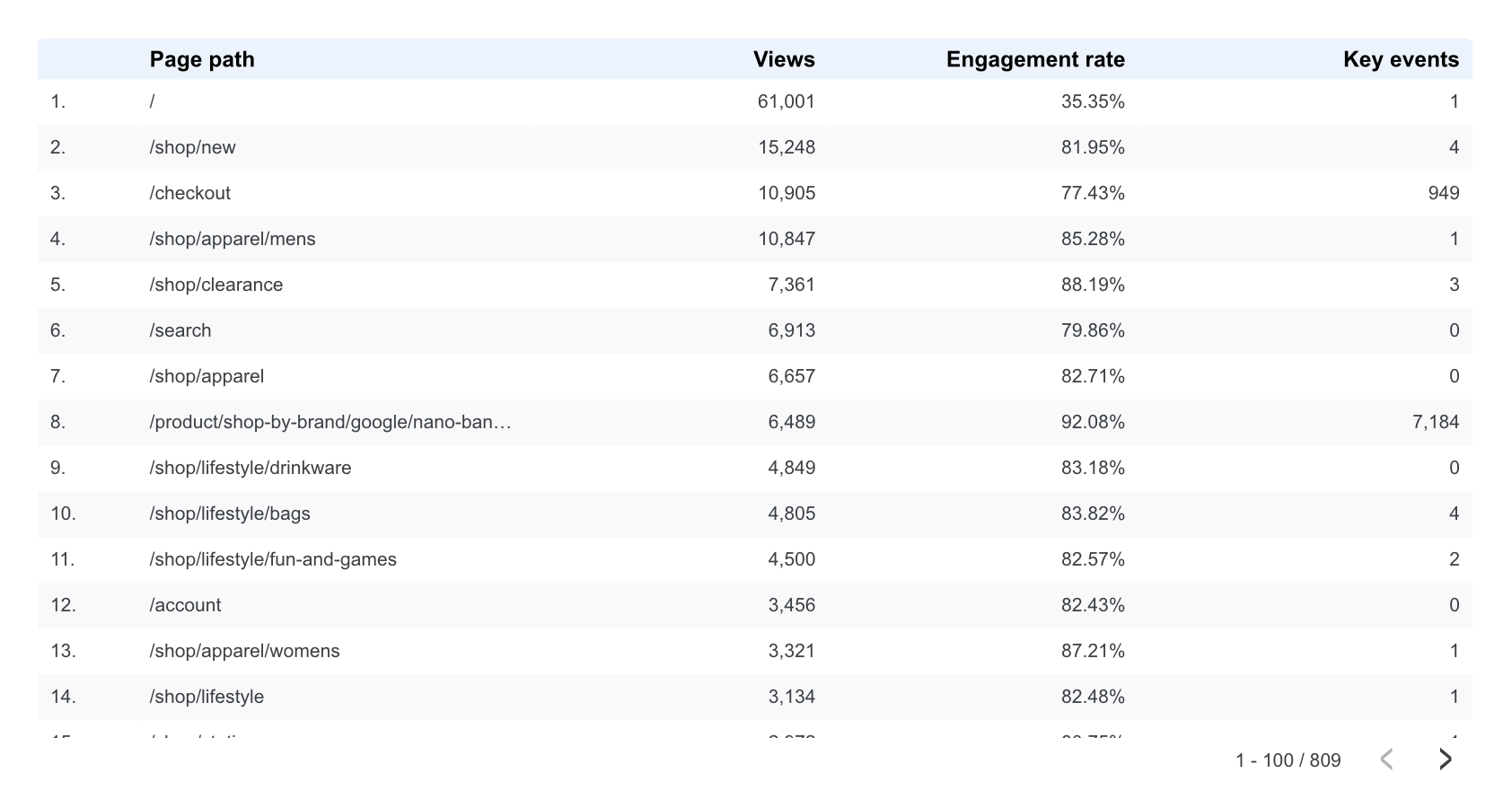
Table
You can add a table to your report to include multiple metrics for a dimension (or dimensions). Tables are useful when you need to provide more granular data in a report.
Theme
Instead of styling individual charts you can modify colors, fonts and other elements with the report theme. To view the theme select the report canvas (and deselect any charts), then select ‘Theme’ on the layout and theme panel on the right of the window. See also style.
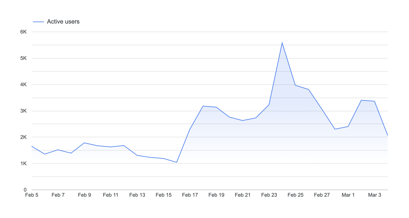
Time Series
A time series allows you to view trends in data for the date range.
Toggle Grid
When editing a report there is a visible grid that makes aligning charts and other elements easier. You can hide the grid when editing a report by selecting 'View' and then 'Toggle grid'.
Treemap
A treemap chart shows the relative size of dimension values based on a metric. Each dimension value is displayed as a rectangle, with larger rectangles representing higher metric values. You can customize the appearance using the Style tab, including color options, border radius, and data labels.
Trendline
You can add a trendline to a time series chart to show the overall trend of the data. To add a trendline, select the chart, select the ‘Style’ tab in the properties panel on the right and then select the type of trendline you would like to add. You can add the following types of trendlines:
Linear
The linear trendline adds a straight line that follows the data in the chart.
Exponential
The exponential trendline is used to show the trend in data that is accelerating or decelerating (in other words rising or falling at a rapid rate).
Polynomial
The polynomial trendline is a curved line that is useful for data that changes over time.
Moving Average
The moving average trendline smooths your data by showing the average value for the date range, helping to highlight the overall trend.
URL Embed
Embed content in your report from other websites. For example, you can embed your website in a report, a video from YouTube, a Google Sheet, etc.
View Mode
Navigating to 'Theme and Layout' and selecting the 'Layout' tab lets you adjust the 'View Mode'. You can use these settings to adjust how the report is displayed when it’s being viewed. You can choose to hide the report header, change where the page navigation is positioned and resize the report to the screen size.
Zoom Area
When using the geographic map chart you can choose the zoom area. This allows you to control how much of the world map is included in the chart. You can choose continent and subcontinent regions using the zoom area.
Get The Looker Studio Glossary PDF
You can download my Looker Studio Glossary to keep in on your hard drive or print out for a quick and handy desk reference.
Get the Looker Studio Glossary