Effective Data Visualization in Looker Studio
Loves Data
Data visualization is an essential skill for anyone working in digital marketing and analytics. It transforms complex data sets into easy-to-understand visuals that can drive informed decision-making. Looker Studio offers robust tools that help you create compelling data visualizations. Whether you're new to Looker Studio or looking to refine your skills, understanding core visualization techniques can significantly improve the quality of your reports.
Grasping the basics of data visualization in Looker Studio is the first step. This involves familiarizing yourself with the platform's interface, learning how to import data, and exploring the fundamental visualization types like charts, tables, and graphs. Once you’re comfortable with the basics, you can move on to leveraging Looker Studio’s key features to create more effective and impactful visualizations. These features include customizing styles, applying filters, and utilizing calculated fields to derive insights from your data.
As you progress, diving into advanced techniques can elevate your visualizations further. Techniques like combining multiple data sources, applying drill-down capabilities, and using interactive elements can make your reports more dynamic and insightful. Additionally, knowing how to share and collaborate on your reports ensures that the insights you generate are accessible to all relevant stakeholders, fostering a data-driven culture within your organization. By mastering these aspects of Looker Studio, you’ll be well-equipped to create visualizations that not only look great but also provide tangible business value.
Continue reading to learn more about Looker Studio and watch our Looker Studio tutorial for a step-by-step explanation of how to create your first report:
Understanding the Basics of Data Visualization in Looker Studio
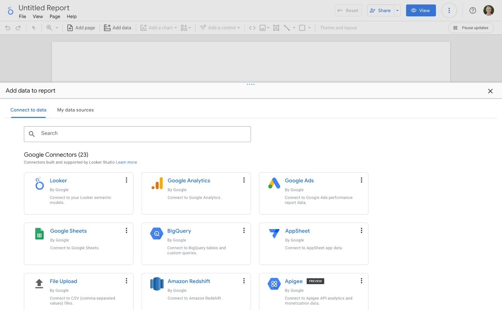
Grasping the fundamentals of data visualization in Looker Studio is essential for creating effective reports. The first step is to get comfortable with the Looker Studio interface. Once you log in, you’ll find a dashboard where you can start a new report or open an existing one. Navigating through the interface will help you understand how to add data sources, create charts, and customize your visualizations.
Start by importing your data. Looker Studio supports a wide range of data sources, from Google Analytics to third-party databases. Connecting your data is usually straightforward, thanks to the platform's user-friendly connectors. After importing your data, look at the different types of visualizations available. Basic visualization types include bar charts, pie charts, line graphs, and tables. Each type has its strengths and is best used under certain conditions. For example, bar charts are great for comparing different categories, while line graphs are ideal for showing trends over time.
Familiarizing yourself with these basics ensures you can create visualizations that convey your data clearly and effectively. The key is to start simple and gradually experiment with more complex visualizations as you become more comfortable with the platform.
Key Features for Effective Data Visualization
Looker Studio offers several features that can significantly enhance your data visualizations. Leveraging these features effectively can help you turn basic charts into compelling stories. One essential feature is the customization options available for each chart type. You can adjust colors, fonts, and layout to match your brand or the story you want to tell. Customizing styles help your visualizations stand out and be more engaging.
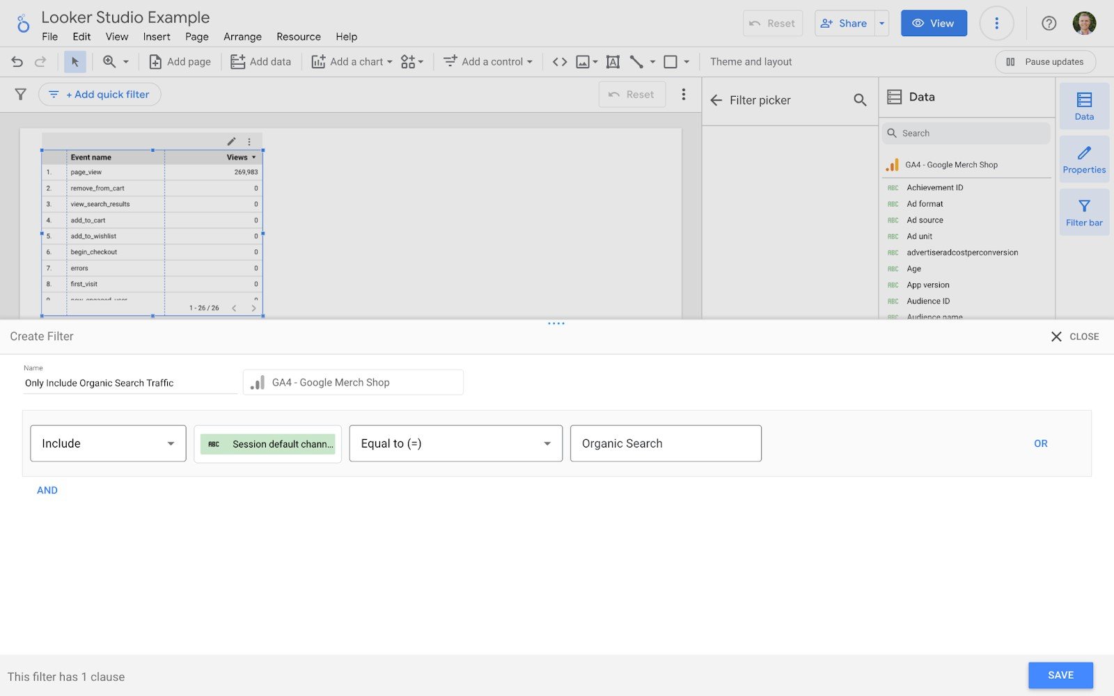
Another powerful feature is filters. Filters allow you to focus on specific data points, making your visualizations more relevant. For example, you can create filters to display data only for a particular time period or geographic location. This adds a layer of interactivity to your reports, as viewers can adjust the filters to see the data that matters most to them.
Finally, calculated fields enable you to create new metrics and dimensions from your existing data. This is particularly useful if you need to derive insights that aren’t readily available from your data set. For instance, you might want to calculate custom conversion rates or average profit margin. By creating these calculations within Looker Studio, you can provide deeper insights without altering your original data source.
Utilizing these key features will make your data visualizations more detailed, interactive, and effective at conveying the insights that matter most to your audience.
Advanced Techniques to Enhance Your Visualizations
Leveraging advanced techniques in Looker Studio can take your data visualizations from good to great. One advanced method is combining multiple data sources. Looker Studio allows you to blend data from different sources to provide a more comprehensive view of your metrics. For instance, you can merge Google Analytics data with data from your CRM to create a more detailed customer journey analysis.
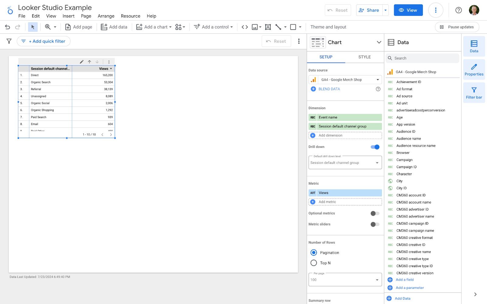
Another technique is using drill-down capabilities. Drill-downs let viewers explore data at different levels of detail. You can set up your charts to allow users to click on a data point to see more granular information. For example, a user could click on a country in a map visualization to view state-level data. This interactivity makes your reports more dynamic and enables deeper insights.
Using interactive elements like date pickers and dynamic controls also enhances user experience. By allowing users to adjust the parameters of the data they're viewing, you make your visualizations more relevant and user-friendly. This can be especially useful in dashboards that need to cater to different departments or decision-makers within an organization.
Best Practices for Sharing and Collaborating on Reports
Effective data visualization isn't just about creating compelling visuals; it's also about making sure the right people see them. Looker Studio offers several features that facilitate easy sharing and collaboration on reports. One of the best practices is setting up permissions effectively. You can control who has access to your reports and what actions they can perform, such as viewing, commenting, or editing. This ensures that only authorized users can access sensitive data.
Utilizing the sharing options in Looker Studio is another key practice. You can share reports via email, link, or embed them in other platforms. This flexibility makes it easy to integrate your visualizations into existing workflows or presentations. Additionally, you can schedule email delivery of reports to keep your team updated automatically.
Features like quick filters and version history are invaluable for team projects. Quick filters allow stakeholders to drill-down on particular dimensions without having to edit the report, making it easy to analyze subsets of data. Version history lets you revert to previous versions of your report if needed, providing a safety net during collaborative editing.
Conclusion
Mastering data visualization techniques in Looker Studio can drastically improve how you analyze and present your data. From understanding the basics to applying advanced techniques, each step enhances your ability to create impactful visualizations. Key features like customization, filters, and calculated fields refine your reports, making them more engaging and insightful. Advanced methods such as combining data sources and using interactive elements elevate the quality of your visualizations further.
Sharing and collaborating effectively ensures that your insights reach the right audience and foster informed decision-making. By leveraging these tools and techniques, you can transform your data into clear, actionable insights that drive business success.
Ready to take your data visualization skills to the next level? Explore the comprehensive Looker Studio training and resources available at Loves Data to enhance your proficiency in Looker Studio. Join our community and start creating powerful data visualizations today!


Comments