14 data visualization tips you need to be using
Loves Data
Data visualization is everywhere. It’s on the street, it’s on your screens – in your pocket, on your wrist and in your hand. It is everywhere.
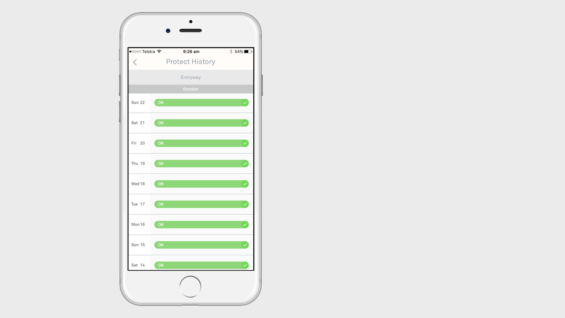
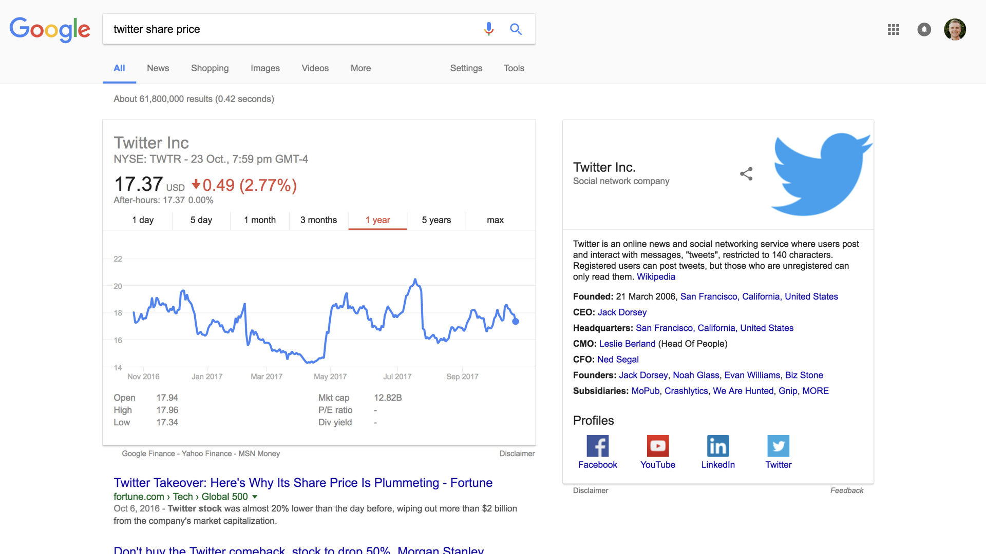
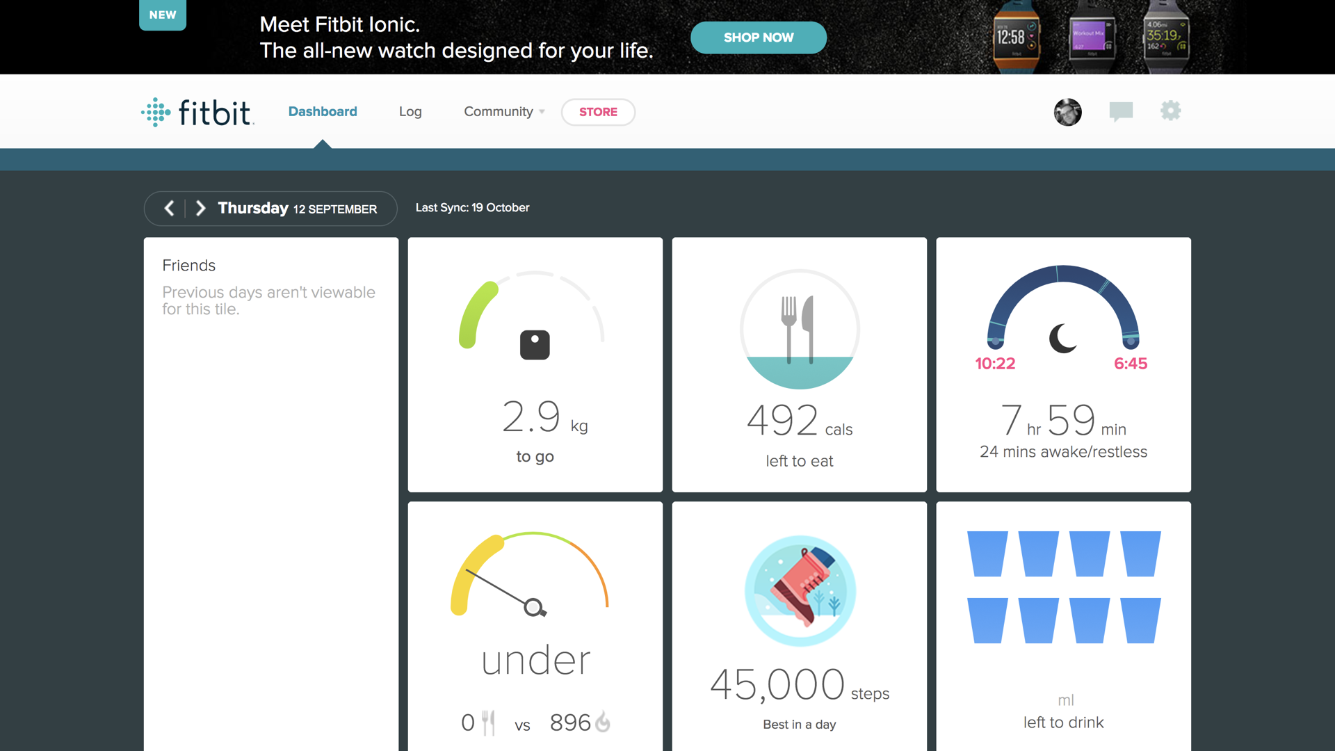
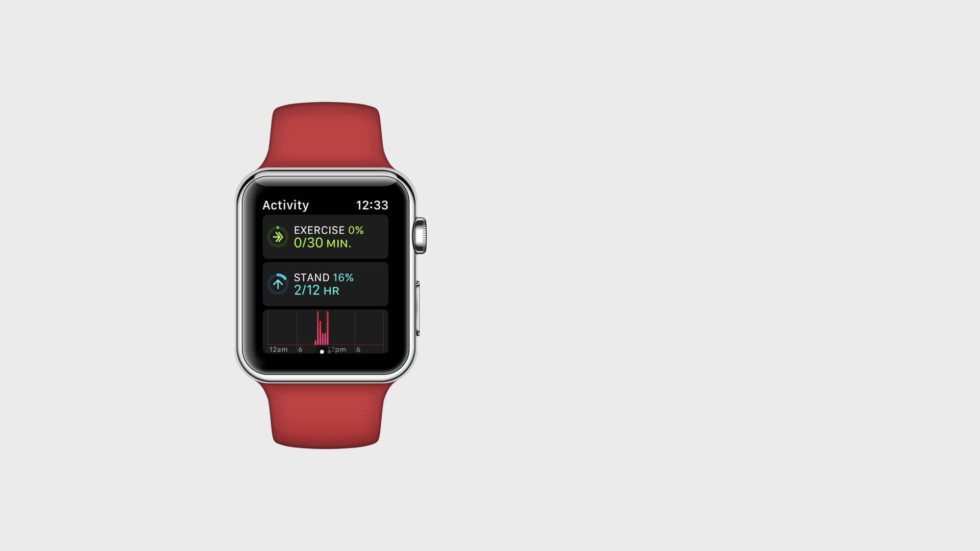
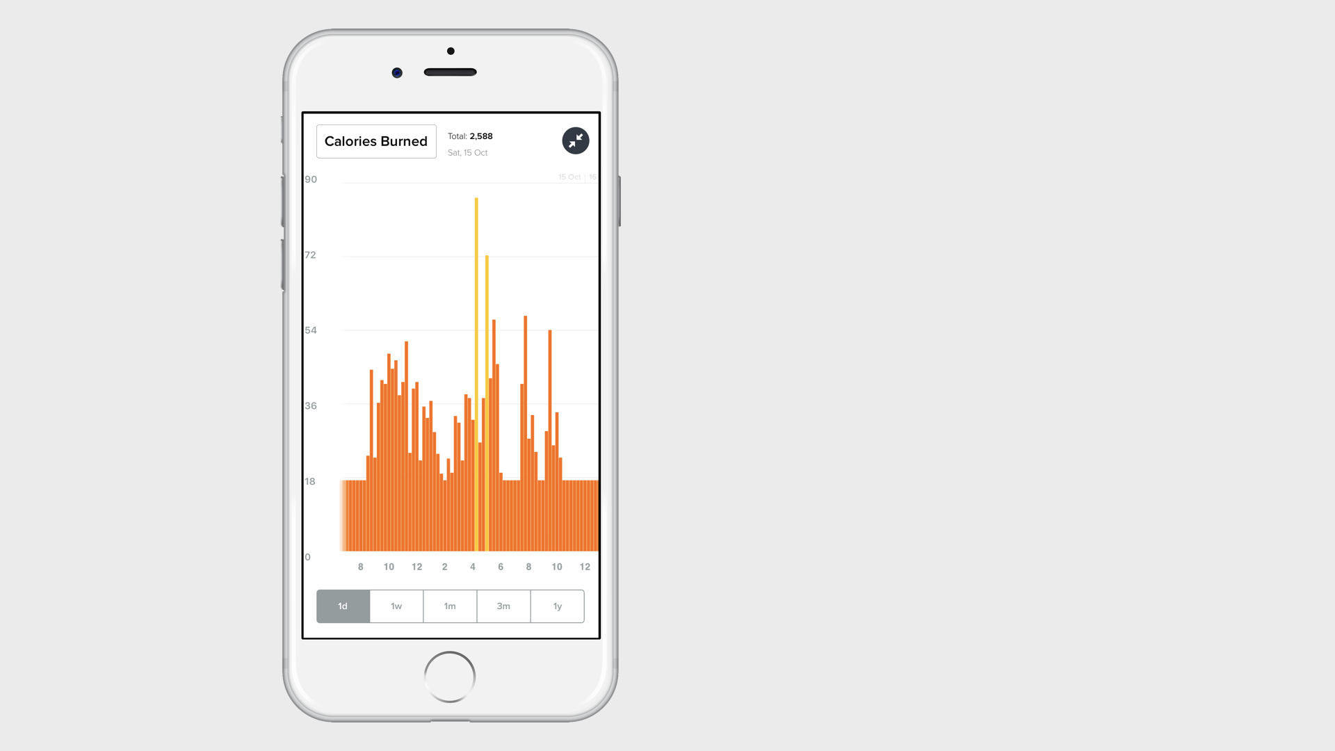
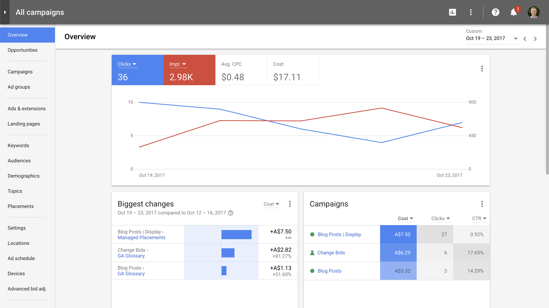
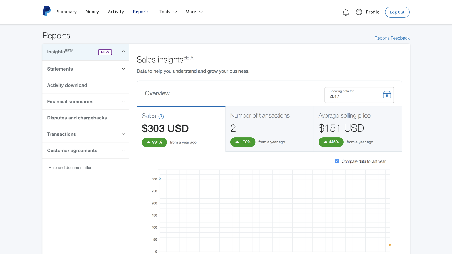
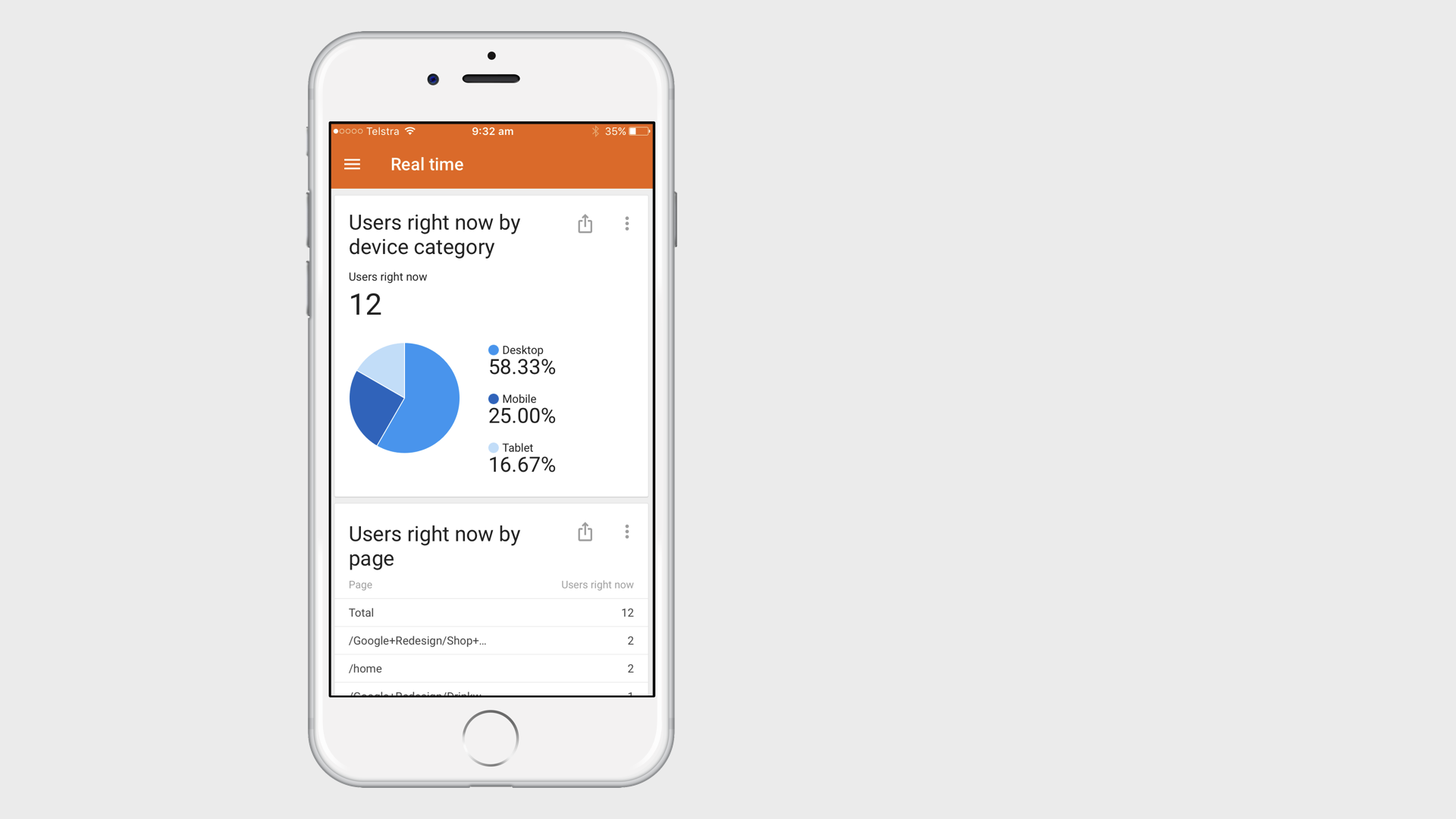
Since we're all exposed to more and more data, visualizing it has become increasingly important for marketers. It's essential to get it right. It only takes a couple of clicks to export a report from Google Analytics and it’s not that hard to create a dashboard using Google Data Studio (or your tool of choice), but being easy doesn’t automatically translate into good data visualization.
You need to make sure you’re visualizing data the right way. You want to score three goals with your data visualization. Overall, you want the data to tell a story, you need to consider the context of how the data will be seen and you want it to be well presented.
Here are my top 14 tips for getting your data to tell its story.
- Consider the context – Who’s seeing the data?
- Use the right chart – What data are you visualizing?
- Understand the purpose – What are you trying to show?
- Consider layout and hierarchy – What is the priority?
- Use the right ordering – Descending? Alphabetical?
- Include comparisons – Are you adding context?
- Keep it simple – Are you only including what’s needed?
- Consider color – Are colors consistent? Do they aid analysis?
- Use the right data – Are you using the right metrics and dimensions?
- Explain the data – What’s included? what’s excluded?
- Choose the right tool – How will you visualize the data?
- Tell a story – Are you engaging your audience?
- Experiment – Have you tried different visualizations?
- Be dynamic – Are your dashboards and reports evolving?
#1 Consider the context
Take time to get to know your audience. Who’s going to be using the data? The way you visualize data for your CEO will be different to the way you create a report to discuss the success of a recent campaign with your marketing team. Your audience will also inform what you include (and cut) from your report or dashboard.
#2 Use the right chart
From bar charts to scorecards, from scatter charts to heat maps, there are lots of ways you can choose to visualize data. You’ll need to spend time selecting the right chart for the job. Here are some pointers.
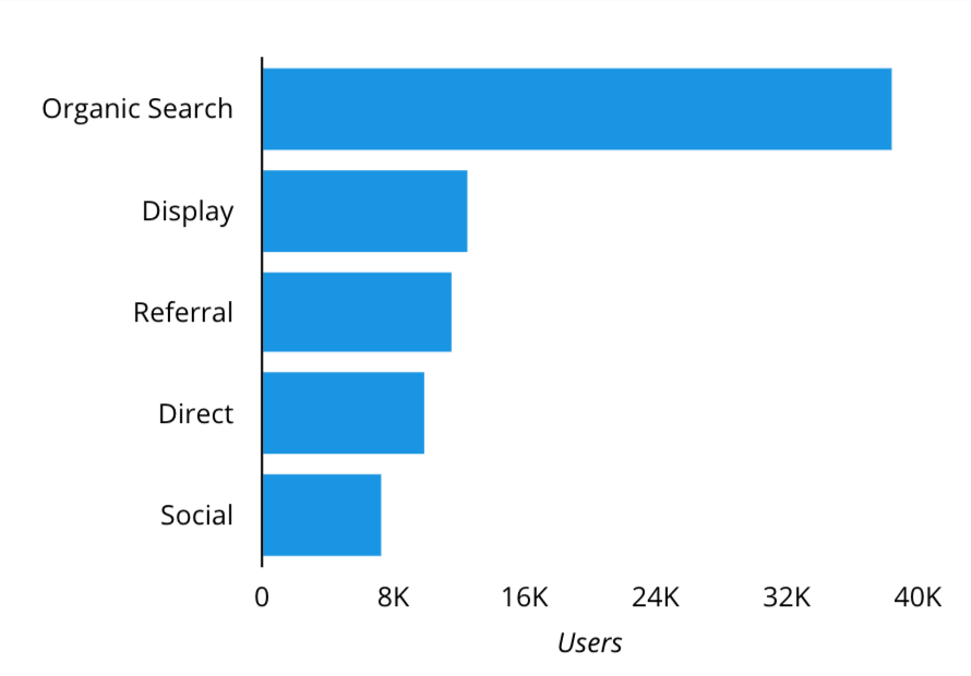
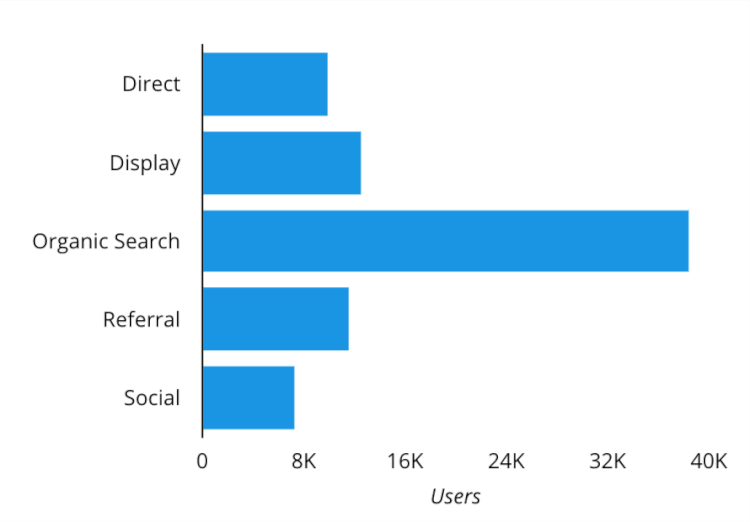
Bar charts are perfect for comparisons. Like comparing the amount of traffic coming from your top marketing channels.
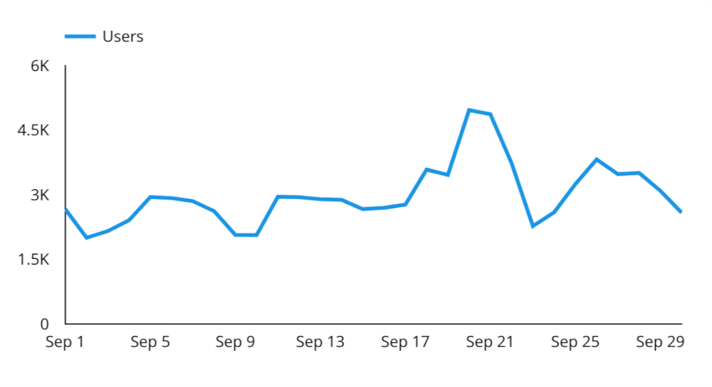
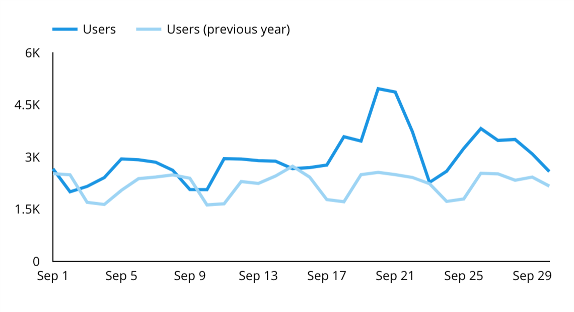
Line charts are ideal for showing changes. If you want to show the seasonal trend for a metric like users, revenue or conversions, then a line chart is a great option.
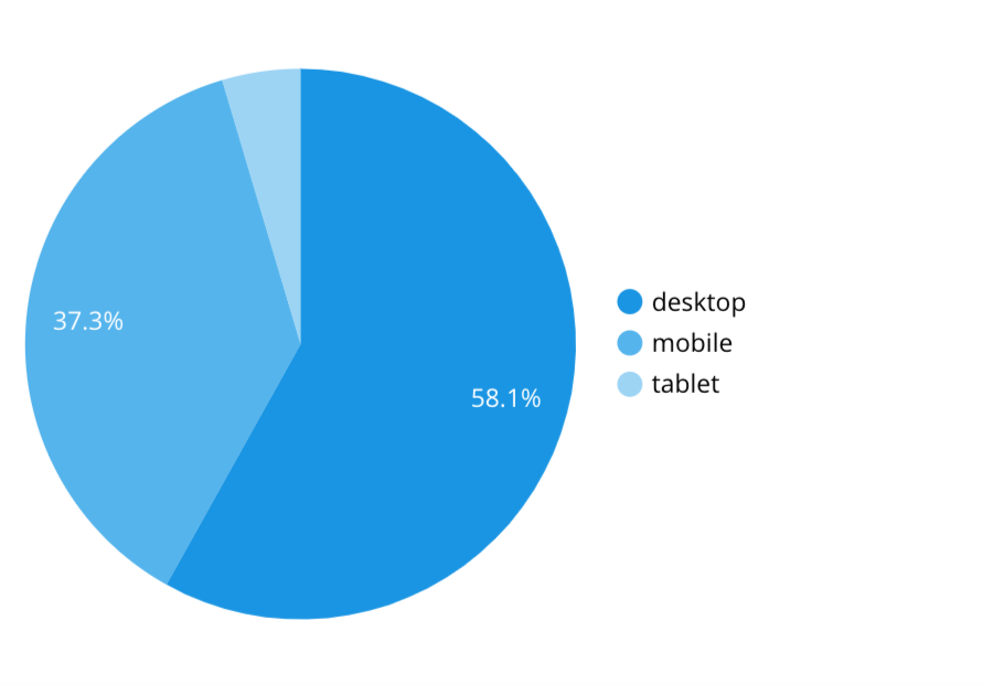
Pie charts are suited to showing proportions. For example, if you wanted to show the percentage of people converting on mobile devices compared to tablets and computers.
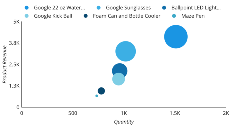
Bubble charts can be used to show relationships. Like showing the traffic to product pages along with their total product revenue.
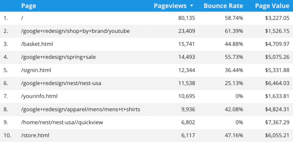
Tables are great for presenting detail. Sometimes you need more than a simple visualization and this is where a table can work better than using multiple graphs, like when you want to show multiple metrics for a dimension.
#3 Understand the purpose
This relates to the context, but it’s where you consider what you’re trying to show? Why are you visualizing this data? When you have the answers you’ll also be able to decide on the format for your data visualization.
You might be creating a dashboard where information needs to be visible and digestible in a single glance. For example, a real-time dashboard showing sales figures for an online store. On the other hand, you might be creating a report where you need a summary followed by analysis and detailed tables. Or maybe you’re creating an infographic, a bite-sized summary for a presentation. These all serve a different purpose, requiring different approaches to data visualization.
#4 Consider layout and hierarchy
Following on from the purpose and the format you should consider the layout and hierarchy. The design of your dashboard is likely to be landscape, while a report might be portrait. You’ll also need to prioritize which pieces of data are most important. What needs to go first? What needs to stand out? Can anything be removed?
#5 Use the right ordering
It can be easier to identify and interpret differences in a chart by using appropriate ordering. For example, ordering this bar chart by value makes it easy to see the most important content on the website.
Before

After
#6 Include comparisons
To show seasonal trends it can be helpful to include date range comparisons. For example, if you have a seasonal campaign every year, then including a year on year comparison makes it easy to compare performance.
Year on year comparison
Try to keep lines to a minimum when using line charts. One or two lines are ideal, but don’t include more than four as they will become difficult to interpret.
#7 Keep it simple
Apart from steering clear of 3D charts, you should keep things as simple as possible. Avoid extra graphics that will distract from the data, remove patterns and textures, and aim for a simple, clean design.
#8 Consider color
If you have multiple graphs that present the same data, like a social dashboard that includes two bar charts, then make sure the color for each social network is consistent. For example, make sure the data for Twitter is always presented in blue (and not blue in one graph and orange in another).

#9 Use the right data
Check that you’re using the right data for the visualization. This includes checking that the data is in fact what is described (you don’t want ‘sessions’ reported if the chart heading says ‘users’) and also ensure the data is relevant for the audience (including a metric like ‘page value’ is unlikely to be relevant to your CEO). It shouldn’t take long to check you’re using the right data and it can prevent lots of embarrassment.
#10 Explain the data
Include a heading with each chart and label metrics and dimensions. Make sure labels are helping your audience interpret the data, too many labels can make it even harder to see trends and understand what’s being presented.
#11 Choose the right tool
There are lots of ways to visualize your data. If you’re visualizing data from Google Analytics, then you can use Google Data Studio, Google Sheets or another tool, but in some cases you might find the in-built dashboards meet all of your audience’s requirements. Use the tool that will visualize the data in the way you need and that gets the job done as efficiently as possible.
#12 Tell a story
If you want to engage your audience, then telling a story is a useful technique. Consider what you’re trying to communicate and think about including a beginning, middle and end. This can be as simple as deciding how to order charts on a page, to crafting a narrative that takes your audience on a journey.
#13 Experiment
Take time to experiment with different data visualization. You might find surprises when you try something new. Start by trying different charts, changing the layout and even including different data.
#14 Be dynamic
Dashboards, reports and the way you visualize data isn’t static. It’s unlikely you’ll be using the same dashboard or report in 12 to 18 months. You might find objectives shift, you need to include different data or something else changes. Your dashboards and reports will evolve, just like the data you’re collecting.
Conclusion
It’s getting easier to visualize data and by applying these tips you’ll be well on your way to making your data visualizations easier to interpret and more engaging. It’s time to make your data stand out! Have a data visualization tip you’d like to share? Let me know in the comments below.




Comments