Crowdsourcing the Presidential Campaign
Loves DataObama vs Romney in Conversion Optimisation
The better part of a billion dollars has been raised by both the Barack Obama and Mitt Romney camps in the lead-up to the US presidential election on Tuesday November 6. This in itself is remarkable, but what is truly remarkable, is the fact that Obama has raised $637.3 million from contributions smaller than $2500 in comparison to Romney's $388.1 million from this category of donor. The NY Times' campaign finance infographic reveals that 56% of Obama's $637.3 million worth of sub-$2500 donations have been under $200.
The Obama camp has raised a whopping 356.9 million dollars from a massive number of small donations.
That is four times the number of donations that Mitt Romney has raised in this category. If we assume that all of these donors contributed $100, that would account for 3.6 million donors – over 1.5% of the US voting-age population.
These small donations are from ordinary people, most of whom have probably made small contributions online using the donations forms for each camp.
While it must be noted that this can be partly explained by the fact that Obama's support base includes a much larger number of the United States' lower income population, the experience of filling out the donation form for each candidates is vastly different.
Donation Page Teardown: Why Obama is the king of conversions
The Obama camp appeal to the public to "help build this movement" with their donations page at https://contribute.barackobama.com/. You can "make a difference" by supporting the Romney camp at https://www.mittromney.com/donate.
A quick look at the source code for both these pages reveals that they've both been using the same tool to optimise their donation pages – Optimizely – but it seems that Obama has been far more successful!
So let's take a look at why Obama's donation page has been so much more successful. Our analysis points to a combination of user experience as well as a vastly different approach to both visual and written communications.
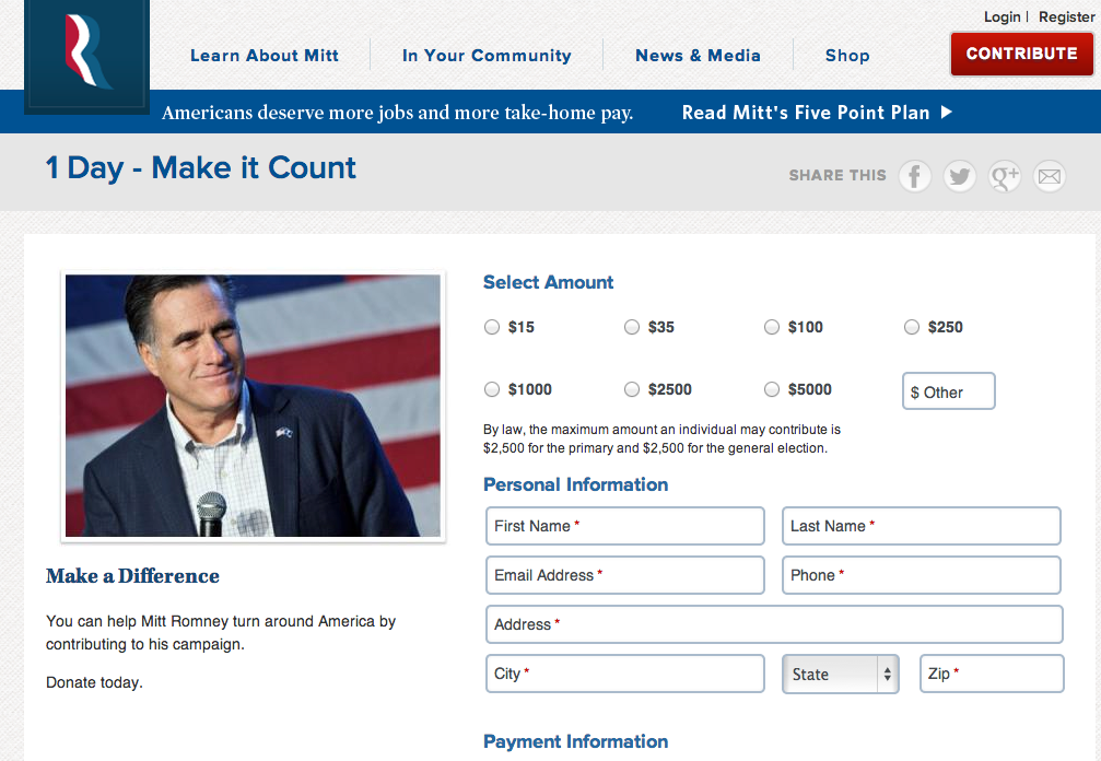
Donate today - Mitt Romney
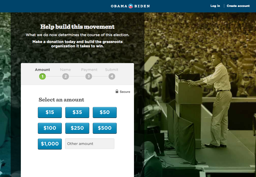
Donate today - Barack Obama
The Message
Obama's message positions the donor as part of the campaign. He pointedly presents visual and verbal images that position himself amongst the public, and the donor as part of a wider, grassroots movement.
In contrast, Romney appeals to us to "help" his campaign – the donor is external, helping Mitt to "turn around America". Obama asks us to "help build this movement" and states that it takes grassroots organisation to win.
Obama is pictured full screen, presenting to thousands of people, connected to the masses, while Romney is depicted in a small portrait, devoid of the public, standing on front of a US flag. Obama's communications campaign has been tied to the public – and according to the campaign donation data, it worked!
Layout and Information Structure
Romney's page is dominated by Romney. The valuable piece of real estate is his photo, just in case you forgot who you were donating to. Obama on the other hand, uses this space for his donation form, recognising that this is not a branding page, it's a donation page. The message is the donation process. Obama himself is looking towards the donation form, directing visitors to the form and positioning them amongst the masses of supporters in the background image.
In their information structure, the two pages take fundamentally different approaches. Obama's page, housed on its own URL, is a donation page – in fact, it's a donation site. The site offers nothing other than the ability to contribute to the campaign. Romney's page on the other hand, is a page within the campaign site. If you think about donating for a second, then there are plenty of distractions – that moment of political motivation may pass as you browse back to campaign news. Obama keeps his page free of distractions and offers his visitors no such options.
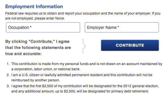
For Romney, the necessary terms, conditions, and explanations for form fields are positioned inline. If the visitor doesn't care about them, they still need to sift through them as they find the fields that they actually need to pay attention to.
Romney-submit
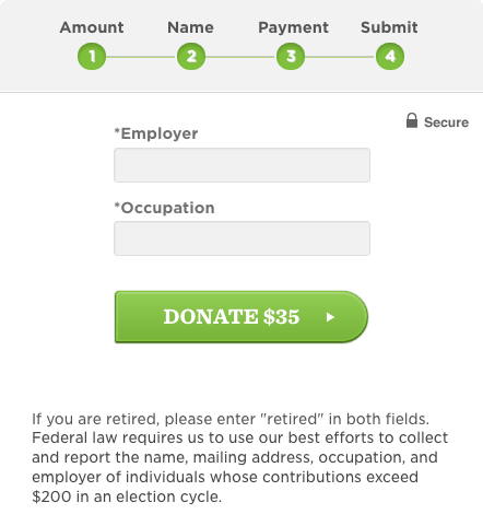
Obama's approach is far more streamlined – terms and conditions are included at the bottom of the page, visually separated from the donation process. The form fields are uncluttered and clearly labelled, while explanations sit well below, visible for those who need them, while those who don't need them can get to the relevant form fields with relative ease.
Obama-submit-v2
The User Experience
Romney presents us with a long, daunting form – the hassle of filling out the donation form is evident from the start. Obama presents us with a series of buttons so we can get started by choosing the amount that we want to donate.
Both donation processes require a lot of information in order to comply with federal law. Obama requests this information a step at a time, with slick transitions between each screen. When it comes to payment, Romney asks for a little more – CVV, the credit card verification value, and he provides the option of "I know my referrer's information", which is appears to be part of some kind of fundraising referral program.
Both of these contribute to making the form just that little bit more cluttered – as we know, an uncluttered, streamlined process of information gathering typically results in the greatest number of conversions.
Default Donations
For Romney, little attention has been paid to the sub-$200 donations that contributed so much to the Obama campaign. Let's face it, confronted with these options, you'd feel pretty cheap making a $35 contribution, when it looks like they're really looking for people who select the $1000, $2500 and $5000 options.
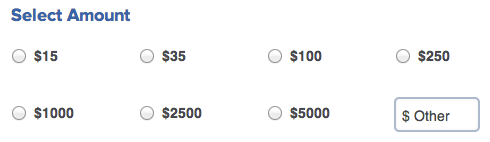
Romney-Amount-Options
For Obama, the majority of default donation options are less than $200, with the maximum default option set at $1000.
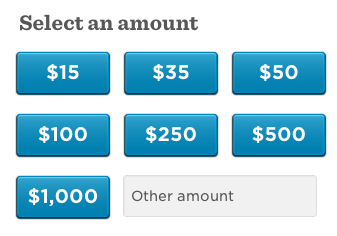
Obama-Amount-Options
Wrap up
There are plenty of lessons that we can take away from the immense success of Obama's donation page, that apply to all donation pages, and to a lesser extent, to checkout processes and other goal navigation paths.
- Keep distractions to a minimum and catch the user in their moment of motivation: you are appealing to a visitor who clicked on the donation page when they felt motivated to contribute, this moment that might pass, do what you can to keep the prolong the motivation and engage the user.
- Keep forms simple, and separate the intended user interaction from the required detail: an uncluttered donation page prevents the visitor from feeling overwhelmed, do not include terms and conditions inline, separate them from the main form so that users can refer to them, but do not have to sift through them unnecessarily.
- Know your audience, appeal to people and communicate their place in the story: it is not surprising that Obama's pointed engagement with the general public resulted in a large number of donations from that demographic – know your audience, appeal to them directly, and try to understand how much they'd like to donate and why they'd like to donate.
Here at Loves Data's offices in Sydney, Australia, we've got just the one staff member who is eligible to vote in the US election, and we're (mostly) apolitical. While most of us aren't on top of US policy issues, we do have a lot of geeky people here who are passionate about conversion optimisation. Obama has crowd-sourced his way into our hearts with his slick donation page – and the data shows that he's engaged with four times the number of small donors than his rival.
If Obama comes through and wins a second term, on November 6, we'll see it as a win for landing-page optimisation and well-considered digital communications strategy!
Comments