Creating Visual Stories with Looker Studio
Loves Data
Transforming plain data into engaging visual stories can capture attention and drive better understanding. Looker Studio, previously known as Google Data Studio, is a powerful tool that transforms raw data into clear, interactive visuals.
Visual stories allow you to convey complex information in a simple, engaging way. By using Looker Studio’s features, you can create interactive reports and dashboards that make data more accessible and understandable.
In this article, you will dive into how to use Looker Studio effectively. Learn about its features, step-by-step processes to create visual stories, best practices for data visualization, and compelling examples to inspire your own work. Empower your storytelling with data to make impactful decisions and communicate more effectively.
Understanding Looker Studio and Its Features
Looker Studio is a versatile tool designed to help you create visual stories from data. It offers various features that simplify data presentation and make it interactive. With Looker Studio, you can connect multiple data sources like Google Analytics, Google Ads, Google Search Console, and more.
One key feature is its drag-and-drop interface. This makes it easy for users, even with little technical knowledge, to build reports and dashboards. You can add charts, graphs, and maps to visualize your data effectively. The tool also offers pre-built templates that can save you time and offer inspiration for your own reports.
Another useful feature is real-time data updates. This ensures that your reports always show the most current data without needing manual updates. You can also share your reports with others easily. Looker Studio allows you to export your reports in various formats, or you can share them directly through a URL. This makes it simple to collaborate and communicate findings with your team or clients.
These features make Looker Studio a powerful tool for turning raw data into polished visual stories. The simplicity and effectiveness of the tool help you communicate complex information in an engaging and understandable way.
Ready to get started? Watch our Looker Studio tutorial for beginners and check out our Looker Studio course.
Steps to Create Effective Visual Stories
Creating visual stories with Looker Studio involves several steps. Following these steps ensures that your visuals are not only appealing but also convey the intended message clearly.
- Define Your Objectives: Start by determining what you want to achieve with your visual story. Are you trying to show sales trends, track website performance, or highlight customer behavior? Clearly defining your goals helps you stay focused and choose the right metrics.
- Connect Your Data Sources: Link Looker Studio to your data sources, such as Google Analytics, Google Ads, or other data source. This allows you to pull in real-time data, ensuring your reports are accurate and up-to-date.
- Choose the Right Visuals: Select the appropriate charts, graphs, or maps to represent your data. For example, use line charts to show trends over time or pie charts to display the distribution of categories. The right visual makes your data easier to understand.
- Design Your Report: Use Looker Studio’s drag-and-drop interface to arrange your visuals on the canvas. Add titles, labels, and descriptions to provide context. Ensure your report is well-organized and easy to navigate.
- Customize and Style: Customize your visuals to match your branding or preferences. You can adjust colors, fonts, and styles to make your report visually appealing. Consistent styling helps create a professional look.
- Add Interactivity: Make your report interactive by adding elements like filters and date range controls. This allows viewers to explore the data and focus on the metrics that interest them. Interactive features enhance user engagement.
- Review and Share: Review your report to ensure accuracy and clarity. Once satisfied, share your visual story by exporting it or sharing a direct link. Make sure to provide access to the necessary users while keeping the data secure.
By following these steps, you can create effective visual stories that communicate your data clearly and engagingly. Looker Studio’s features streamline the process, making it accessible for anyone to transform data into compelling visuals.
Best Practices for Data Visualization in Looker Studio
Creating visual stories requires more than just adding charts and graphs. Follow these best practices to make your data visualization more effective.
- Keep It Simple: Simpler visuals are often more powerful. Avoid clutter by focusing on the key metrics. Use white space to create a clean and clear layout. Too much information can overwhelm the viewer.
- Choose the Right Chart Types: Select chart types based on the data and the message you want to convey. Bar charts are great for comparisons, line charts work well for trends, and pie charts are useful for showing parts of a whole. Using the right chart type helps viewers understand the data quickly.
- Use Consistent Colors: Color consistency is important. Stick to a limited color palette to avoid confusion. Use colors to highlight important data points and maintain consistent color-coding throughout your report for patterns and trends.
- Add Context: Provide context with titles, labels, and annotations. Explain what the data represents and why it is important. Adding context helps viewers grasp the significance of the data without needing to ask additional questions.
- Test for Clarity: Review your visuals to ensure they are clear and easy to understand. Share your draft with colleagues or test viewers. Feedback will help you identify any areas that may need refinement.
Following these best practices will ensure your data visualizations are clear, engaging, and effective in communicating your message.
Examples of Compelling Visual Stories You Can Create
Using Looker Studio, you can create a variety of compelling visual stories to convey your data clearly and effectively. Here are some examples to inspire you:
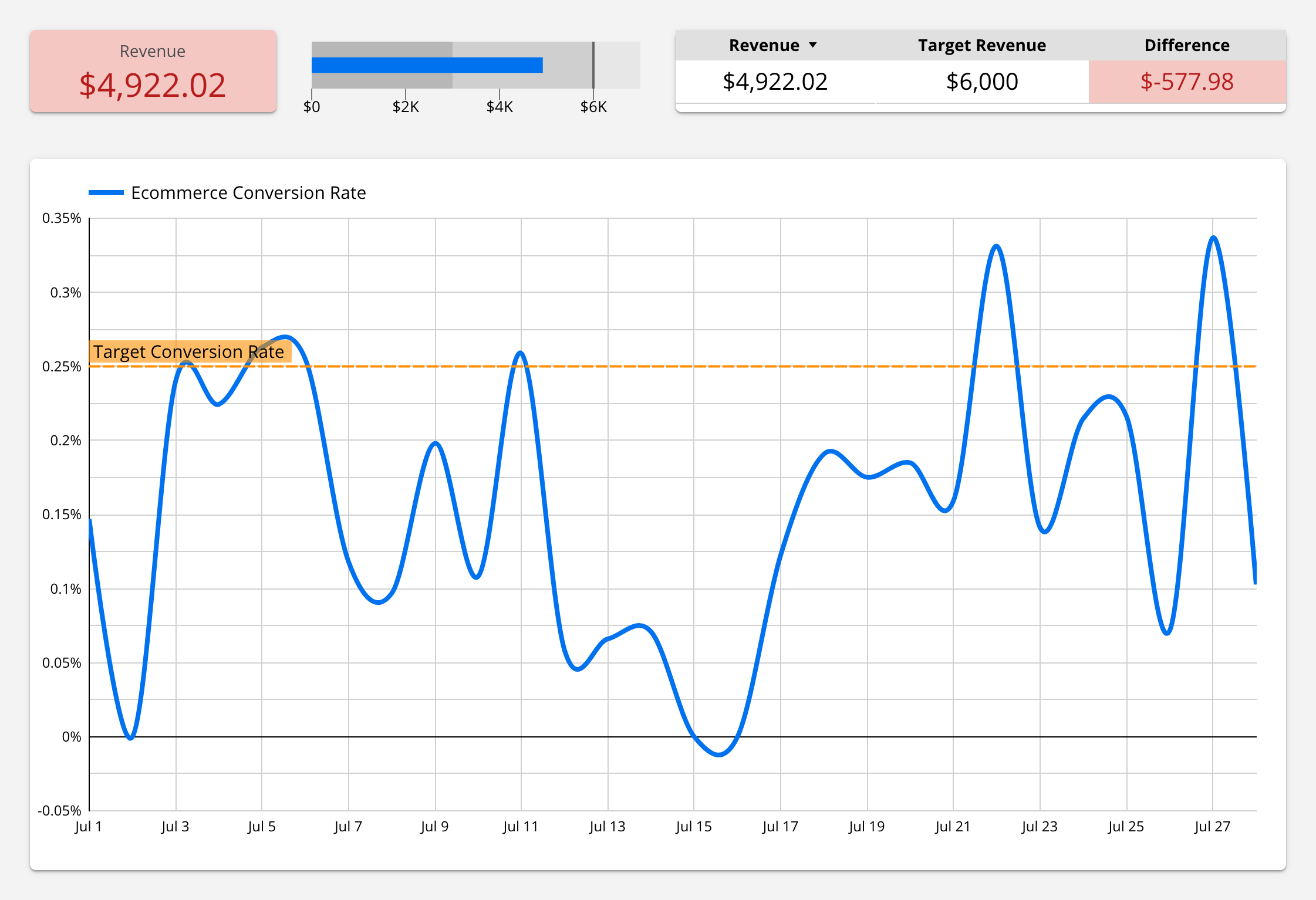
- Sales Performance Dashboard: Visualize sales data with interactive dashboards. Include metrics like total sales, product performance, and sales trends over time. Use bar and line charts to show comparisons and growth. Add filters so users can view data for specific periods or product categories.
- Website Traffic Report: Display website analytics data to track user engagement. Use line graphs to show visitor trends, pie charts for traffic sources, and bar charts for top-performing pages. This report helps in understanding user behavior and optimizing website content.
- Marketing Campaign Analysis: Analyze and present data from various marketing campaigns. Show metrics like click-through rates, conversion rates, and return on investment. Use funnel charts to visualize the customer journey from awareness to purchase. This helps in evaluating the effectiveness of different marketing strategies.
- Customer Satisfaction Survey: Summarize results from customer satisfaction surveys. Use bar charts to show satisfaction levels, pie charts for the distribution of responses, and word clouds to highlight common feedback. This visual story can guide improvements in customer service and product offerings.
Creating these types of visual stories helps in making data understandable and actionable. Each example can be customized and enhanced using Looker Studio’s features to suit your specific needs.
Conclusion
Looker Studio is a powerful tool for creating engaging visual stories from data. By understanding its features and following a clear process, you can transform raw data into interactive and compelling visuals. Best practices like keeping visuals simple, choosing the right chart types, and adding context enhance the effectiveness of your data storytelling.
Whether you are tracking sales performance, analyzing website traffic, or evaluating marketing campaigns, Looker Studio helps you communicate complex information in a clear and engaging way. Compelling visual stories can drive better business decisions and make data accessible to everyone.
Ready to master Looker Studio and create your own visual stories? Explore our expert-led courses at Loves Data to gain hands-on experience and elevate your data storytelling skills. Start your journey to becoming a data visualization expert today!


Comments