How to Create Effective Reports in Looker Studio
Loves Data
Creating effective reports in Looker Studio is essential for making data-driven decisions. Looker Studio, previously known as Google Data Studio, is a powerful tool that allows you to visualize your data in an interactive and accessible way. Whether you are a marketer, analyst, or business owner, mastering Looker Studio helps you present your data clearly and effectively.

In this article, we will guide you through creating effective reports in Looker Studio. From understanding the basics to implementing best design practices, you will learn how to create reports that are not only visually appealing but also highly informative. Let's get started on transforming your data into impactful reports.
Understanding the Basics of Looker Studio
Looker Studio is a versatile tool designed for data visualization and reporting. It lets you connect various data sources and create dynamic, interactive reports. Whether you are pulling data from Google Analytics, Google Ads, or even spreadsheets, Looker Studio makes it easy to compile and display that data in an understandable format.
One of the critical features of Looker Studio is its drag-and-drop interface. This makes creating reports intuitive, even if you are not a tech expert. Without writing code, you can easily add charts, tables, and other visual elements to your reports. This functionality lets you focus on what matters most – telling a story with your data.
Additionally, Looker Studio offers a range of customization options. From choosing different chart types to adding filters and date ranges, you can make your report as detailed or high-level as needed. Using these features can significantly enhance how you visualize and interpret data.
Key Elements of an Effective Report
Creating an influential report in Looker Studio involves good design and insightful data presentation. Here are some key elements that make a report effective:
1. Clear Objectives: Start with a clear understanding of what you want to achieve with your report. Whether it’s tracking marketing performance or monitoring website traffic, having specific goals will guide your report creation process.
2. Relevant Metrics: Choose the most relevant metrics that align with your objectives. Including too much data can overwhelm the viewer and dilute the key messages. Focus on metrics that provide meaningful insights.
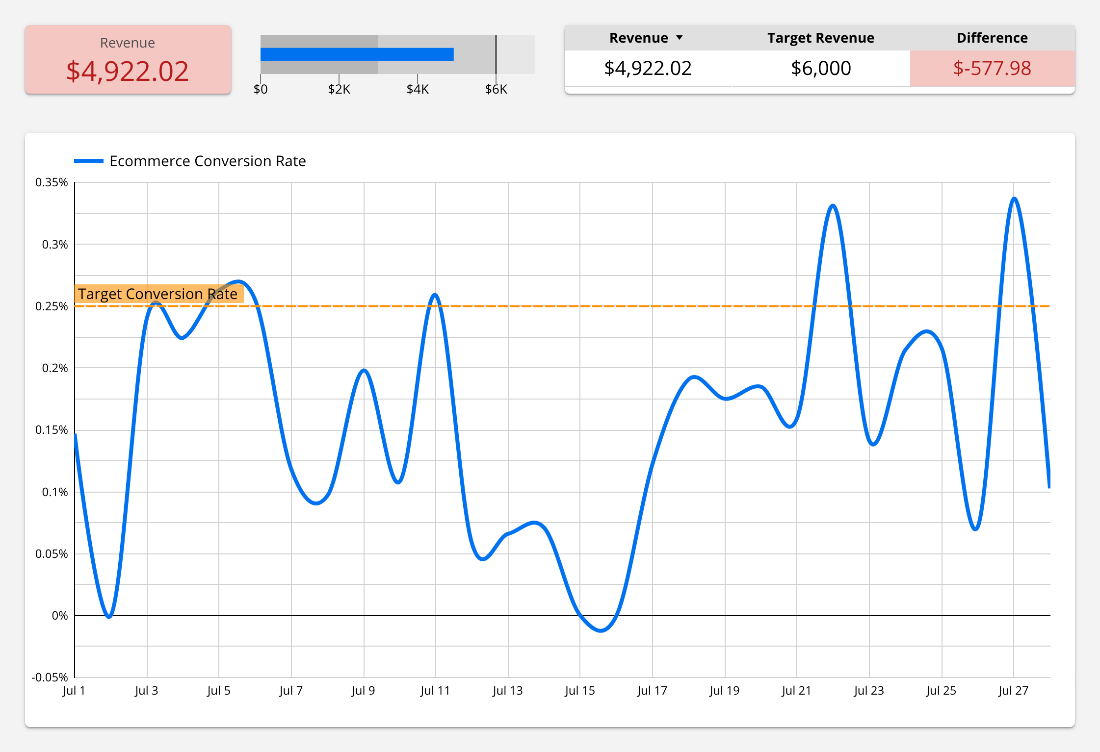
3. Visual Hierarchy: Arrange your data elements so that they highlight the most important information first. Use larger fonts and contrasting colors for critical metrics to draw the viewer's attention where it matters most.
4. Consistency: Maintain consistency in design elements, such as fonts, colors, and chart styles. This creates a professional look and makes the report easier to read and understand.
5. Interactivity: Make your report interactive by adding filters and clickable elements. This allows viewers to explore the data more deeply and find the specific information they need.
6. Annotations and Explanations: Sometimes, data alone isn’t enough. Adding annotations or brief explanations can provide context and help your audience understand the significance of the data.
By incorporating these elements, you can create aesthetically pleasing reports and effectively communicate the insights you want to convey. This sets the foundation for a report that can drive informed decision-making.
Step-by-Step Guide to Creating a Report
Creating a report in Looker Studio can be done in a few straightforward steps.
Watch our 10-minute Looker Studio tutorial and follow these steps to get started:
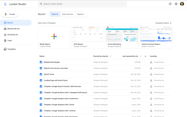
1. Create a New Report: Click ‘Blank Report’ to start a new report from scratch. You can also choose from various templates if you need some inspiration.
2. Connect Your Data Sources: The next step is to add your data source. This could be Google Analytics, Google Ads, or another data source. If you’re connecting to Google Sheets or another custom data source, ensure your data is clean and well-organized for accurate reporting.
3. Add and Configure Charts: Looker Studio provides various charts, such as scorecards, tables, and other types of charts. Drag and drop these widgets onto your report canvas. Configure each chart to pull the correct data by selecting the appropriate dimensions and metrics.
4. Customize Your Report: You can adjust the appearance of your report by changing its colors, fonts, and sizes. Use your brand colors to make the report look professional and consistent with your other materials.
5. Add Filters and Controls: Include date range filters, data controls, and other interactive elements. This allows your viewers to customize the report based on their needs, making it more versatile and valuable.
6. Review and Share: Preview your report to ensure all elements are correctly set up. When satisfied, share the report with your team or clients by generating a shareable link or exporting the report as a PDF.
These steps will help you create a comprehensive and functional report in Looker Studio. It will provide clear and actionable insights.
Best Practices for Designing Your Report
Designing an effective report is not just about the data; it's about how you present it. Here are some best practices to consider:
1. Keep It Simple: Avoid cluttering your report with unnecessary elements. A clean and straightforward design makes it easier for viewers to understand the key insights.
2. Use Consistent Branding: Apply your brand’s colors, fonts, and logos throughout the report. Consistency helps create a professional look and feel, reinforcing your brand identity.
3. Highlight Key Metrics: Use larger fonts or different colors to highlight the most important metrics. This draws attention to the most crucial information at a glance.
4. Incorporate Visual Elements: Use charts, graphs, and images to make the data more engaging. Visual elements help illustrate points more clearly than text alone.
5. Add Contextual Information: Provide annotations or tooltips where necessary to explain the data. This added context helps viewers understand the significance of the information presented.
6. Ensure Accessibility: Ensure your report is accessible to everyone, including those with disabilities. Use high-contrast colors and ensure that the text is legible.
By adhering to these best practices, you can create a report that communicates effectively and looks professional. Well-designed reports help your audience grasp the insights and take appropriate action.
Conclusion
Creating effective reports in Looker Studio can transform how you present and understand your data. By learning the basics, focusing on critical elements, following a step-by-step creation process, and adhering to best design practices, you'll be able to produce reports that are not just informative but also visually appealing. These reports will enable better decision-making and more precise communication of insights.
Are you ready to take your Looker Studio skills to the next level? Loves Data’s Looker Studio Course will take you through the steps to create custom dashboards and reports to present your data. You can join today and enhance your skills. Become a data visualization expert with Loves Data!


Comments