Mash-up and visualise your data
Loves Data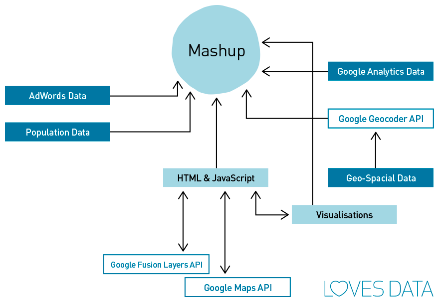
We have never been so well-off in digital marketing when it comes to the mounds of data available to us. But these datasets only have so much utility on their own: sometimes they need a bit more work to make them really useful for other members of your organisation. In this blog, we’ll share our thoughts on how to get more value from our data, by merging it with other data sources and visualising the output in creative ways.
Mashing up
Your digital analytics data is a valuable resource for your business, and is so easily accessible, that you might wonder why it would be necessary to do anything further with it. But the data only tells its own story, and can often leave the bigger picture unpainted. To answer more meaningful questions and extract deeper insights, you can interpret the data in conjunction with other data sources – a mash-up.
The term ‘mash-up’ originated within the music industry to refer to a blending together of more than one track to create something new. Since then, the term has been appropriated and widely used to refer to data apps: combinations of data from multiple sources, intelligently combined together with a sprinkling of visualisation and maybe some user interaction.
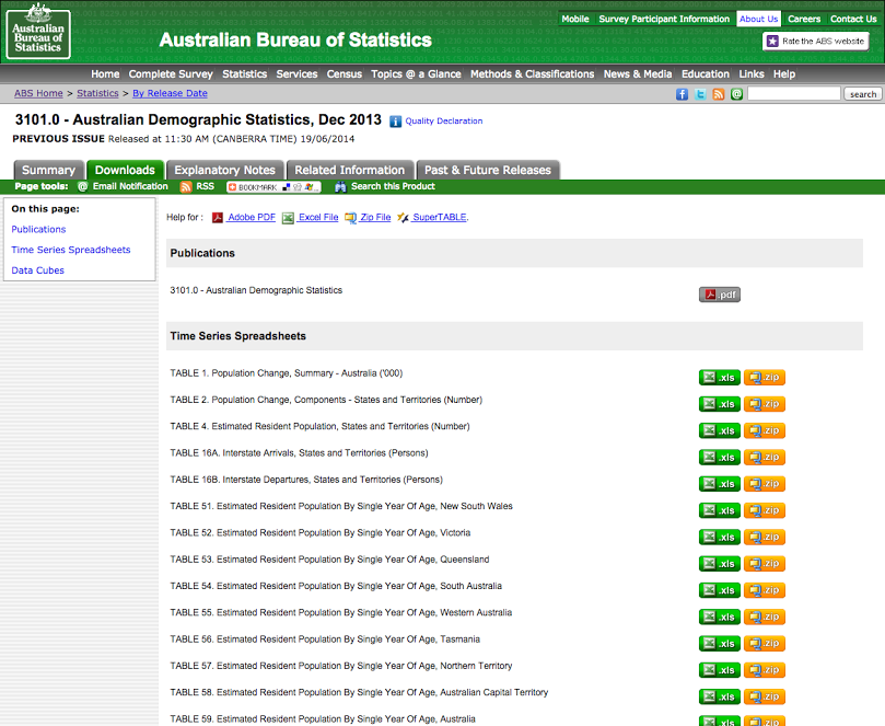
There are plenty of data resources on the web (often freely available), that you can merge with your data. For instance, if you want to standardise your data by age and sex, the Australian Bureau of Statistics has population data freely available for download.
Even better, there are a host of resources on the web that provide Application Programming Interfaces (APIs) that let you query their data in code in way that lets you easily combine it with your own in simple apps. For example, the Google Geocoding API can turn a placename into a set of coordinates for plotting on a map – great for turning long tables of impenetrable data into into something far more visually appealing.
Visualise
A mash-up can be as simple as putting your analytics data in a table in a spreadsheet tab, putting something else – some population data, perhaps – in another tab, and linking the two tables together using a formula to create a chart of the results. Once you have identified and downloaded another source of data that you want to merge, no particular skills are required beyond basic spreadsheet manipulation and usage.
At a more advanced level, you can write a web app in JavaScript to query a public API for some variables related to elements in your own dataset, and then present the combined results in an interactive web app. Frameworks and libraries can help greatly here, such as the free Leaflet library for interactive maps and the d3.js library.
There are also plenty of tools, both freely-available and chargeable, that you could use to present your output. If you have a statistical and programming bent, you might find the R project useful for both processing and mashing together your data and for creating a variety of output charts and graphs.
A simple example
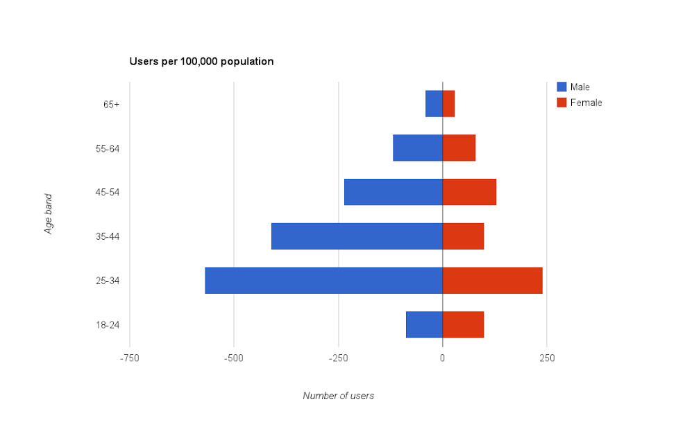
If you have enabled demographic reports in your Google Analytics setup, you will have access to some standard reports in the Analytics interface, both in tabular and graphic form. But wouldn’t it be great to mash that up with population data to discover whether your Australian website visitors are disproportionate from particular age bands or genders? With a mash-up, that question becomes easy to answer in four quick steps:
1. Download your report data into your favourite spreadsheet software.
2. Download population data from the Australian Bureau of Statistics.
3. Using spreadsheet formulae, calculate the number of website users or sessions relative to the size of the population strata.
4. Draw a spreadsheet chart to show off the bigger picture of your website users in an easily digested form.
Have you experimented with mash-ups and visualisations? Do you have a favourite public API for sourcing interesting and useful data? Tell us in the comments below.

Comments